Role: Lead UI Designer
Client: Dashchund Rescue UK
Tools: Figma, Maze, Adobe Illustrator, Google Drive
Duration: 3 weeks
The problem: The current website interface lacks character, a seamless uer journey and call to actions seem quite discouraging to new users.
The solution: A user-centred redesign that focuses on improving usability, engagement, and navigation for users of the website
Project Overview:
This project aims to redesign a small non-profit dog rescue website, to better the navigation, visual interface, and overall user experience of the site. It mostly targets dog lovers and owners who are considering adopting a rescue dog, wanting to enquire and donate to the cause, or looking to read the latest rescue stories and updates.
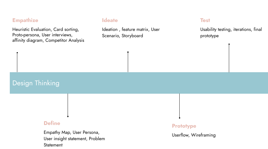
Design thinking
The design thinking methodology is a problem solving approach that focuses on understanding the user needs, generating creative ideas and rapidly prototyping and testing solutions. It involves, empathising with users, defining the problem, ideating potential solutions, prototyping and iterating on those ideas.
UI Analysis
Current Site Homepage
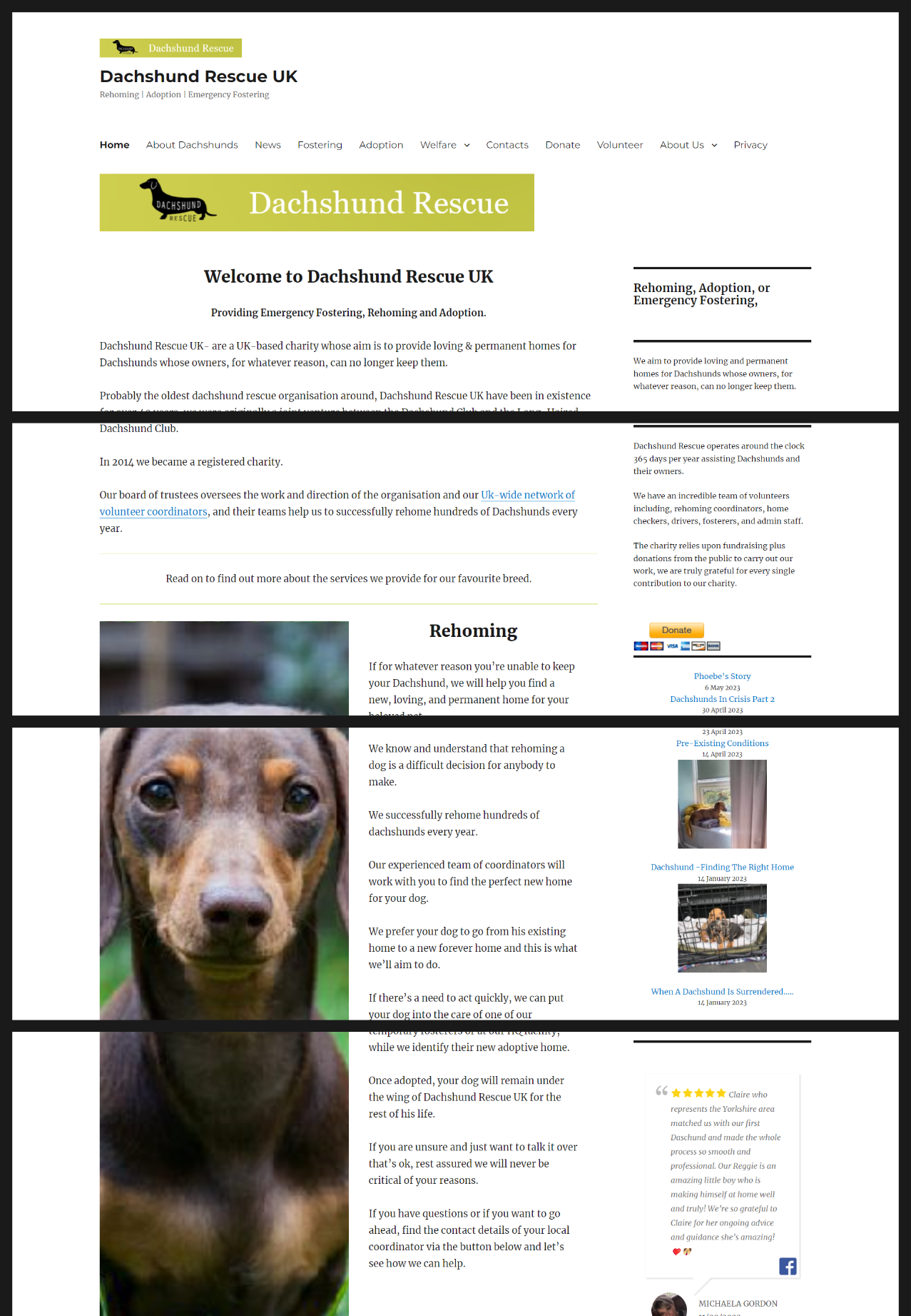
We wanted to analyse what works and what requires improvement on the responsive website, from our own observation. Doing so will ensure that all visible UI issues, alongside user painpoints, are addressed.
Annotation

Heuristic Evaluation

Usability Issues

The challenge is to make the redesign more inviting and easier to navigate, so that users are encouraged to use it.
Empathize
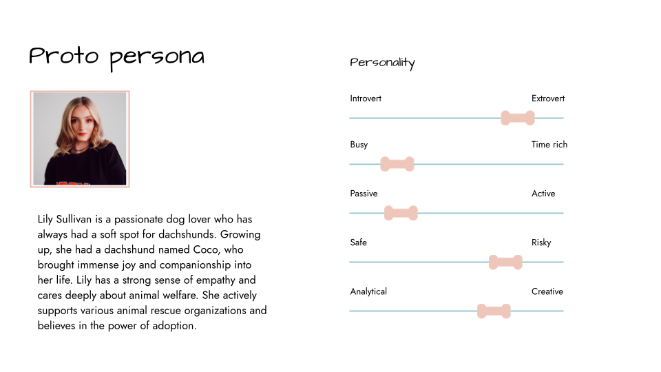
Protopersona
A protopersona was drafted to better understand the target audience and best reflect the user of this website. As a designer, I did not have any past knowledge or exerpeience of dog ownership, adoption and donating, so conducting a protopersona gave me a broad perspective of the typical user of the Dachshund Rescue UK site.
Define

User Persona
The final step was to complete our user persona to create a more reliable and realistic representation of our user. Based on our research, we added user behaviours, goals, pain points and trusted websites and apps.
Problem Statement:
How might we optimize engagement and trust of the non-profit site, so that dog lovers are more inclined to donate or adopt?
Ideate
Storyboard

Obstacles & Challenges
I don’t have a dog of my own or pet in general, so I felt ignorant coming into this project, not knowing what it takes to care for a dog, and what dog owners look out for from non-profit apodation sites. As a result, I took it upon myself to do my own research, truly empathise with our user insights and analyse our director competitors. Doing this improved my knowledge and confidence to proceed with the redesign of the Dachshund Rescue UK website.
Prototype
Style Guide
Logo Design
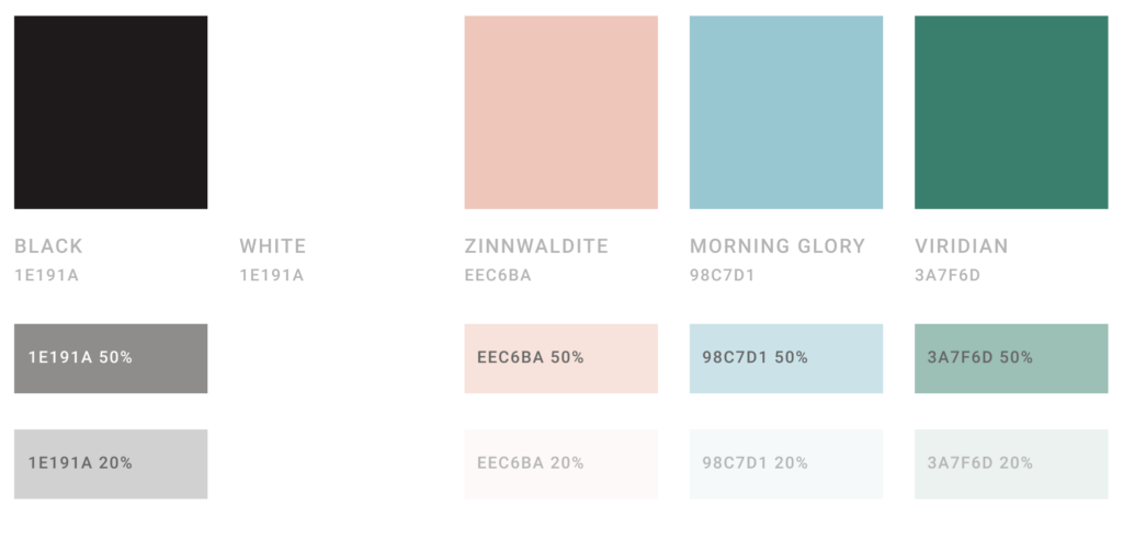
Colour Palette
Userflow

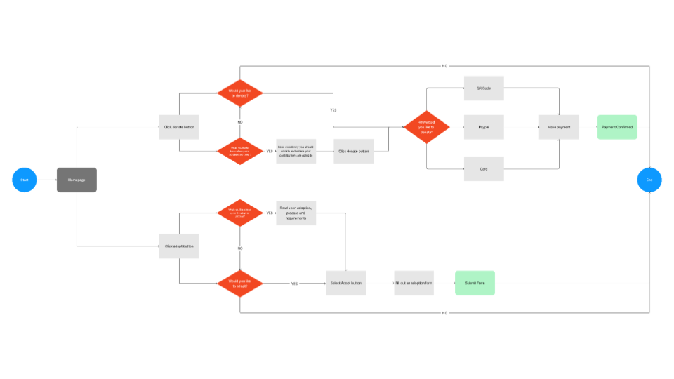
A userflow map was curated to display the key steps, stages and decisions a user will encounter when navigating the redesign of the site.
Modifications were made to our userflow. The initial userflow assumed users would already know to read important information/steps before proceeding to donate or adopt.
The final userflow takes into account user navigation and call to action buttons, whereby once clicked, the user will automatically be directed to the important information/steps section before proceeding to donate or adopt.
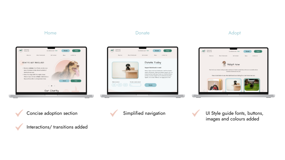
Low Fidelity Wireframes
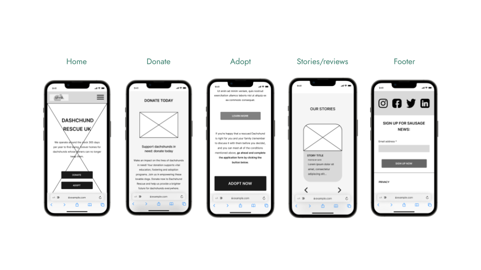
To get a better visual perspective of how the responsive website redesign should be reconstructed and enhanced, I created low fidelity wireframes for both desktop and mobile interfaces.
Test
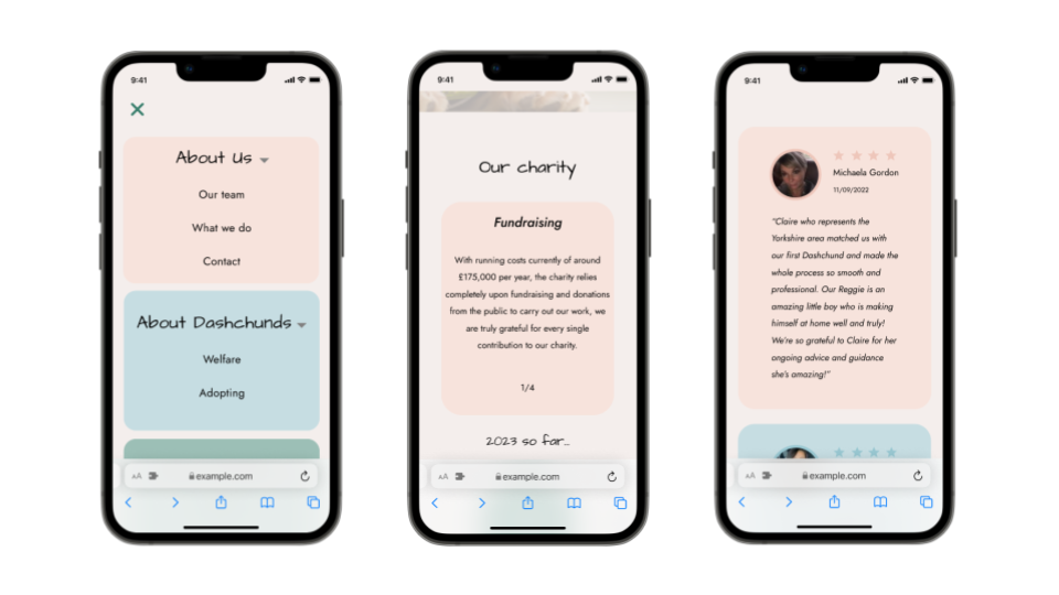
A/B Testing (mobile)
Concept A
We conducted an A/B testing on maze to see which layout and navigation our users preferred. Here is concept A:
- Hero image and text (with faded background)
- Horizontal touch & scroll of charity statements, stories, dogs to adopt and reviews
- Navigation menu
Concept B
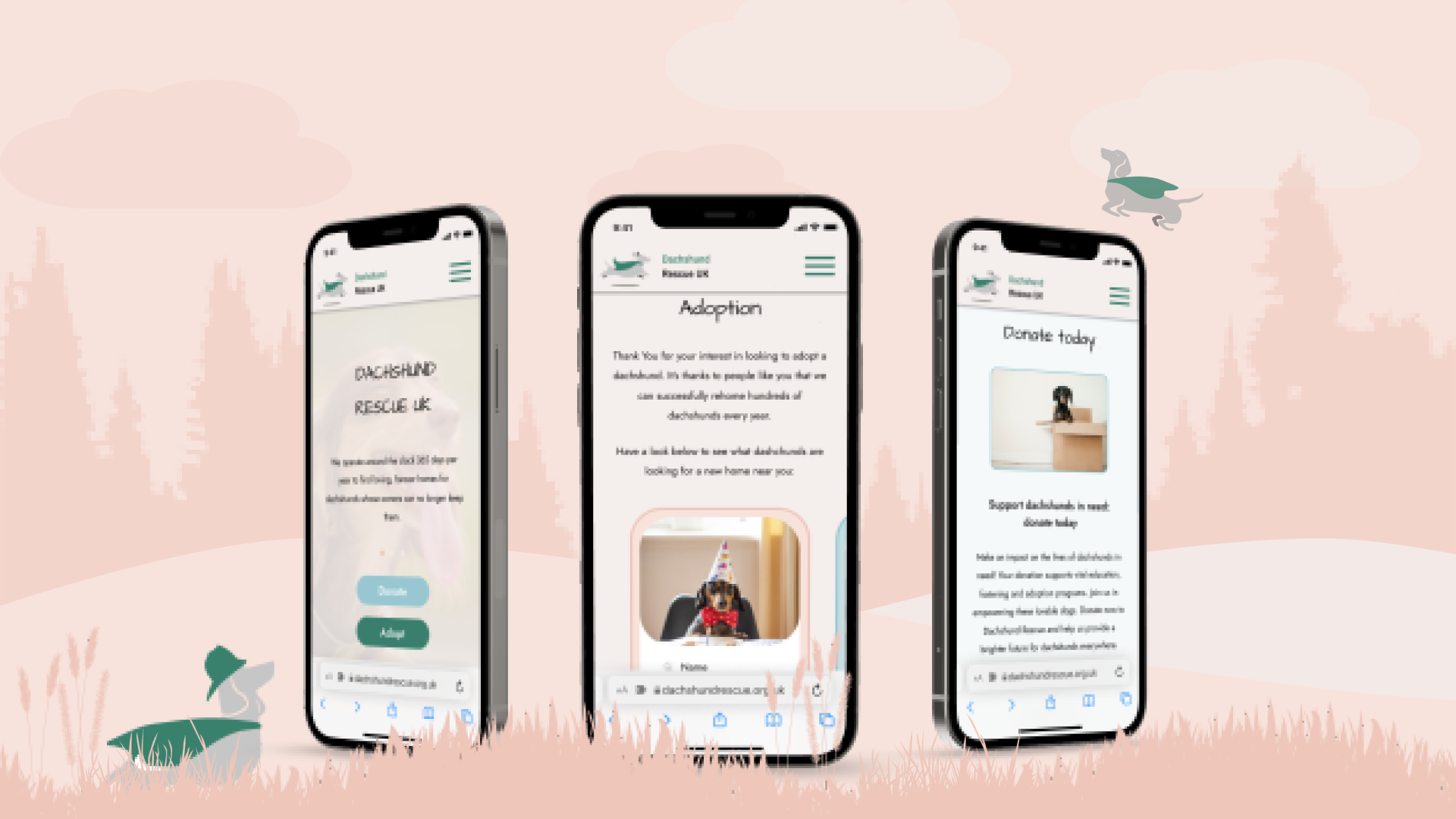
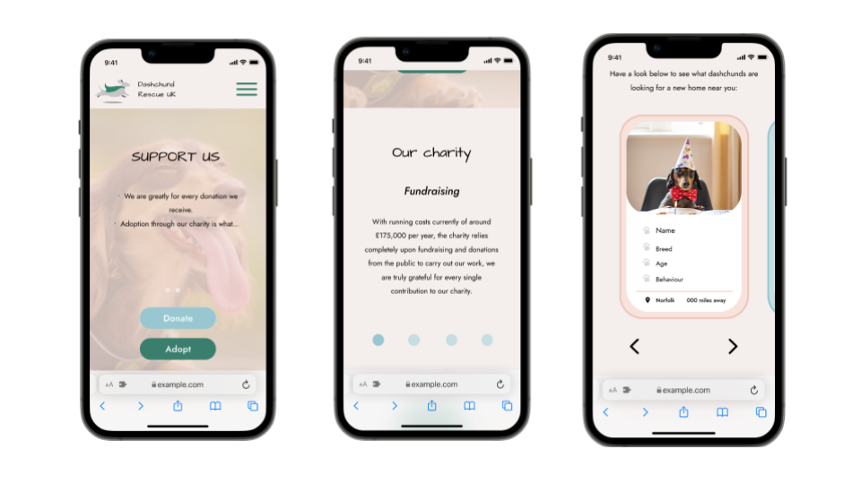
Hifi Wireframes (Desktop)
Comparison
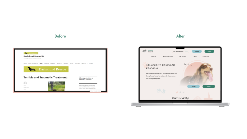
Before & After
Before:
- Lacked character / brand identity
- Misplacement text and imagery
- Unappealing call to action buttons
- Unclear process of adoption & donation.
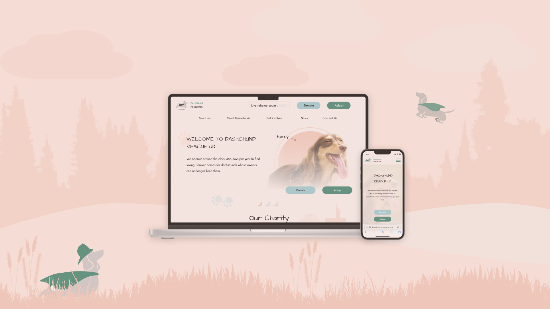
After:
- Playful approach to colors fonts and imagery
- Engaging hero section & animations
- Vital information clear and understandable
- Revived and vibrant UI display representing Dachshund colours
Conclusion
Overall, I was content with redesign, as it addressed the user requirements and painpoints with thorough analysis and consideration.
The main challenge i endured whilst researching and designing this product, was not having prior knowledge or experience with dogs and pets in general. I struggled to fully sympathize and relate to users frustrations and the emotional connections owners have towards their pets or those they would consider adopting from a non-profit.
The main design challenge I faced was receiving user test results in time to address painpoints and apply modifications.
The challenge we faced as a team, was scheduling our collective availability.
If I had more time to develop this project, I would like to:
- Spend more time refining the design for our donation and adoption process
- Reach out to stakeholder/s & Conduct more user interviews/ testing for more feedback and to strengthen design choices.