Role: Sole UX/ UI Designer
Client & Proposal: Deithub (in partnership with NHS)
Sector: Healthcare & Wellness
Tools: Figma, Adobe Illustrator, Miro, Google Drive
The problem: updating and requesting dieticians is a long process. There are unnecessary barriers and overheads, especially for local patients of their respected NHS practice. Diet resources and spreadsheets aren’t reliable enough nor are they easy to follow and commit to.
The solution: A diet and nutrition assistant that offers an easily accessible, manageable and more interactive way of monitoring your diet and health. Its aim to strengthen communication and sharing of resources between patient and health professionals.
User Insights
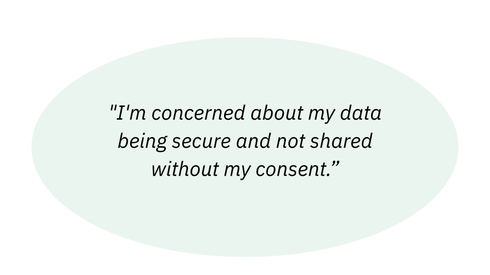
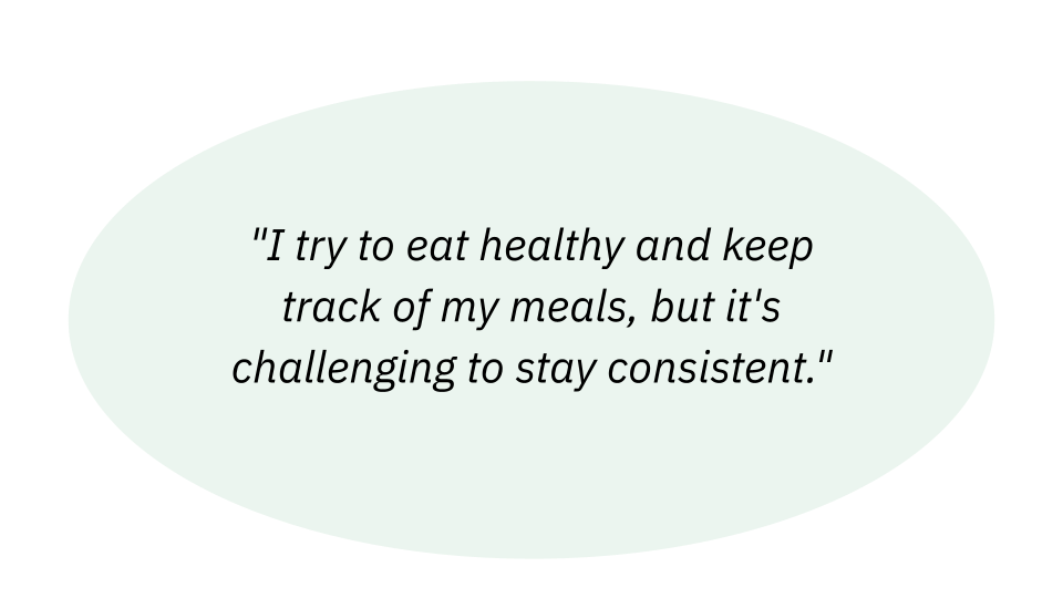
To uncover this case, I wanted to firstly empathize with others who also have health conditions and frustrations with their current form of diet tracking.
This will help identify user painpoints that will need to be considered throughout the case and resolved within the final product

Task Flow
This user journey will follow Jacob , who has IBS and was referred by their dietician via phone call.
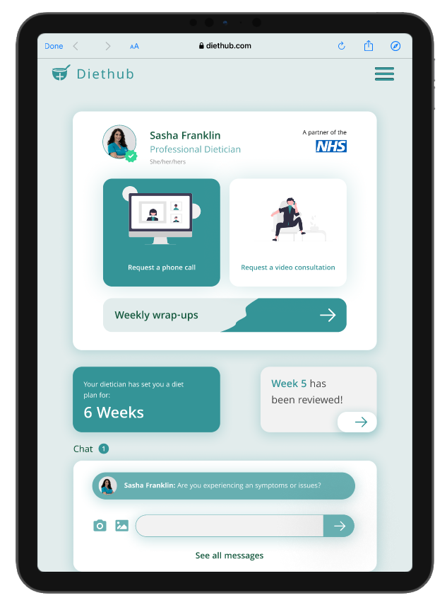
Accessing the app can be done through both referral code or nhs number, followed by some demographic details. At the end of the set 6 weeks diet plan, he’ll be asked to share his weekly wrap up with the dietician, to then receive a final review and complete the diet plan.

Feature Matrix
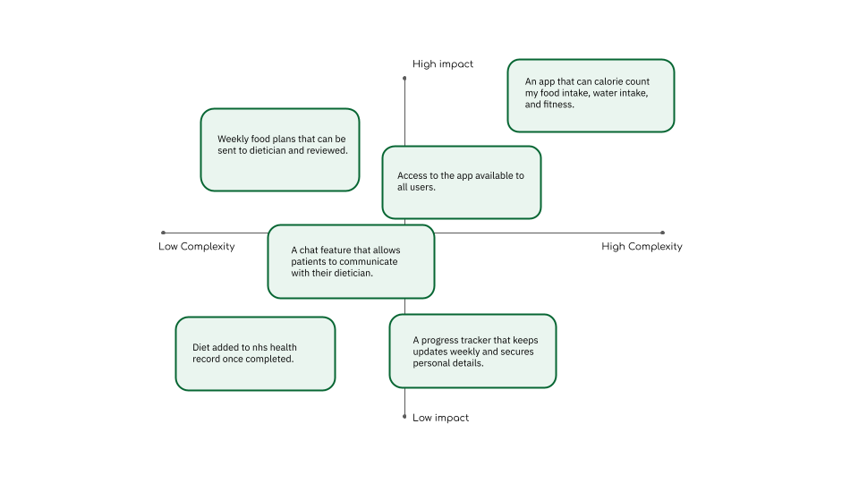
Having identified and appointed a user persona for this case, a feature matrix diagram was drafted to explore the many features this application could incorporate, based on the problem at hand.
These features vary from most impactful to most complex.
Accessibility
To ensure my end product meets the expectations of my target users and offers an improved user experience, I will address the following entities;

Monitorization
Being that this application is to be associated with a government healthcare service, I must address the following:
1. How users gain access.
2. What user details will be remain anonymous.
3. What information sources are permitted and allowed to be shared through the app.

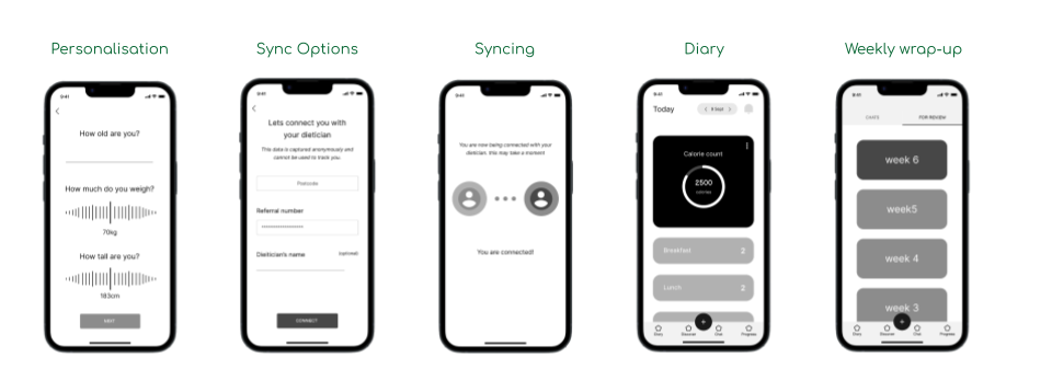
Low Fidelity Wireframes
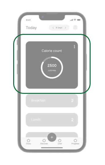
Challenges : Features – Calorie Count
Having a calorie count would require an additional measurement of health/ diet tracking that my app does not focus on. The app’s purpose is to document patient diet plans to monitor their health conditions, not for weight loss or gain.
Challenges : Features – Personal Info
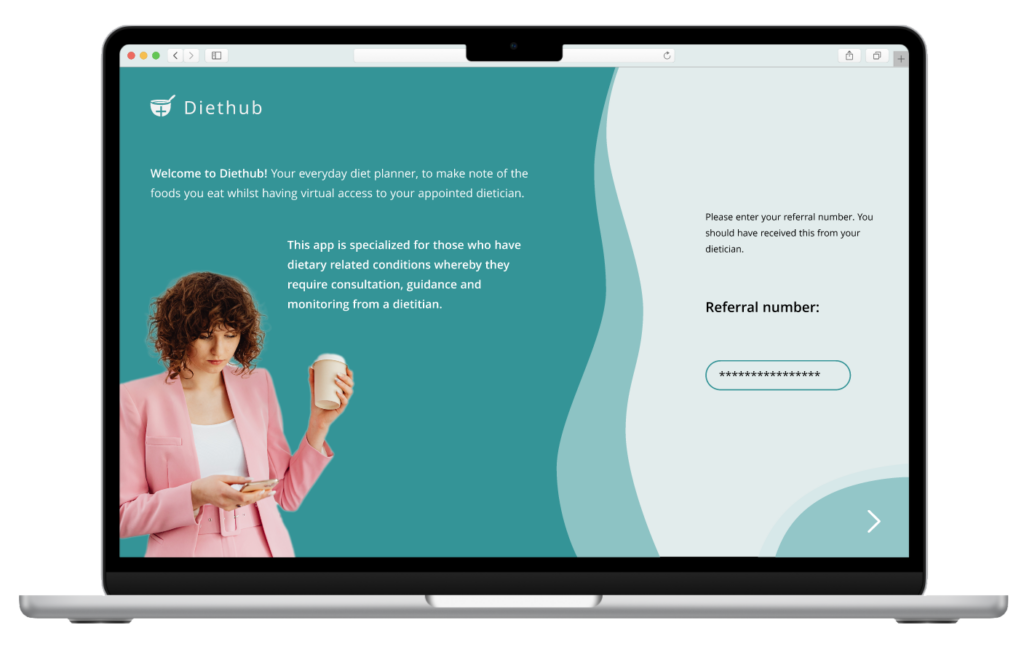
Similarly, requesting an nhs number, BMI details nad your location, all are unnecessary requirements for accessing the app. To keep it simple and accessible, yet still secure, users will only be asked to enter a referral code.

Mid Fidelity Wireframes
Iterated Task Flow
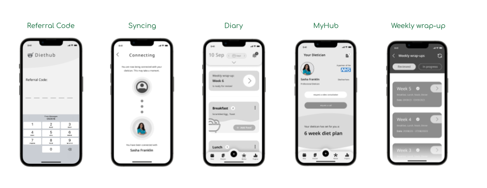
The first step of the general task flow for this user journey has been slightly modified. Instead of users requiring your nhs number and demographic info to be granted access, they only be asked for their referral code and name. This still will ensure security over personal details within the app, yet make accessibility more efficient.

Challenges : Accessiblity
Coming into this project, I wanted the service to be available to all, those who have been referred by a dietician and those who would like to request one. However due to the complexity of developing this feature, I decided to strip back my approach and focus solely on patients who have exclusive access to the app.
Challenges : Eligibility
As much as I’d like for the app to sync with NHS, this would be another feature that requires advanced development and possible sticking to the GDS design guide, which would limit and complicate my design approach.


Style Guide
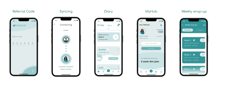
To really bring this app to life, and give it an identity with an aesthetic and authentic appeal, I formulated a style guide that includes components, colour palettes, icons, typography, and buttons.
Challenges : Style Guide
There was a lack of focus when compiling a coherent style guide that reflected the purpose of this app. My direct competitors assisted with the app functionality and elements, however the logo and colour palette was not thoroughly considered, and as a result I struggled to maintain a UI that displayed consistency and clarity.

High Fidelity Wireframes
Hi-fi Fidelity Desktop Wireframes
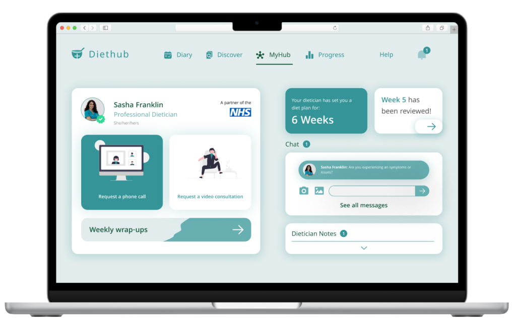
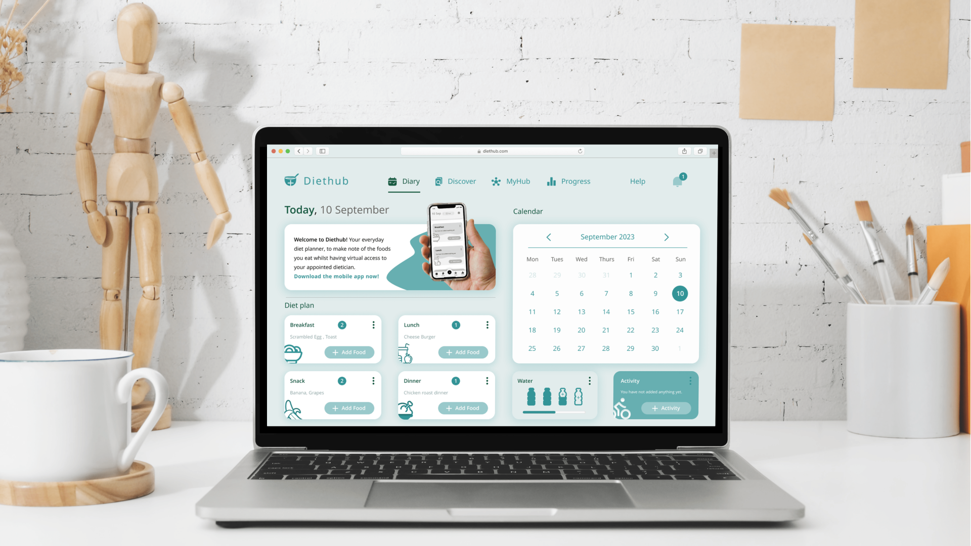
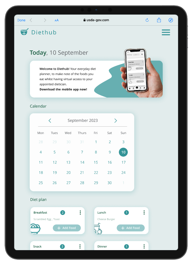
When wireframing the desktop & Ipad version of the app, I intended to maintain the consistency through the use of complementary colours and curve-edged components that each have a drop shadow applied to give off a 3D futuristic effect. It had to be reflective of the mobile app so that the brand identity and functions are conserved and recognisable.
Macbook

Hi-fi Fidelity Desktop Wireframes: Access
Similarly with the mobile application, desktop and ipad device users would also require referral code access. In doing so, I combined both the coaching screens and referral access sign up, displaying a large, transitioning hero image, to entice and inform the users before proceeding to access the service.


Ipad
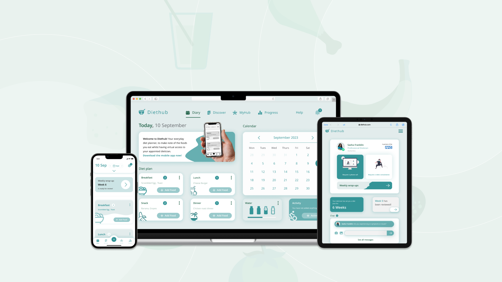
Conclusion & Future Considerations
Overall, I am happy with the outcome of the application. I empathized with my target audience, conducted users testing of the product, identified and acknowledged design obstacles made the necessary iterations, and developed a fully functioning, device responsive app.
Eligibility –this product is assuming that it will be partnering with nhs services and functions. However in reality this is not valid but would be a feature I would like to see implemented
Given that this case study focused on creating a functional and effective solution to a problem, and so where was little consideration for the aesthetics of the application . Therefore for next time I would like to:
- thought into the stylisation of the app, ie the colour theme.
- Once set diet plan is complete, allowing the user to either access other plan set by dietician or convert to a personal planner.
- Allow all user access, whereby users can request an available dietician via the app
- Add helpful instructions to each screen to guide and direct users

