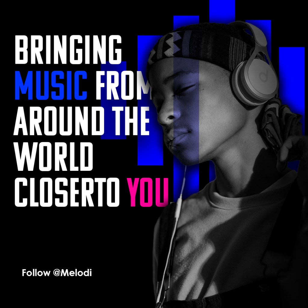
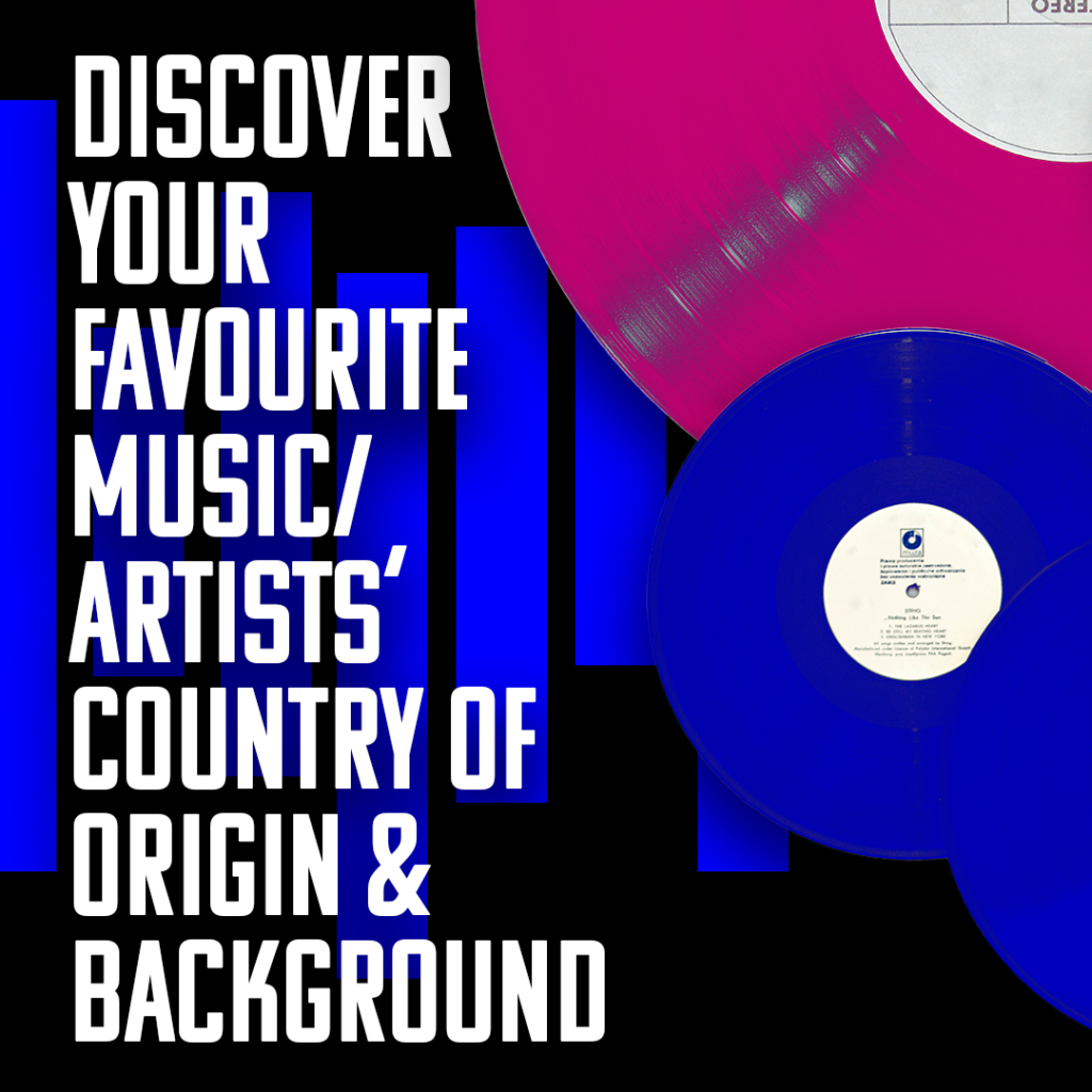
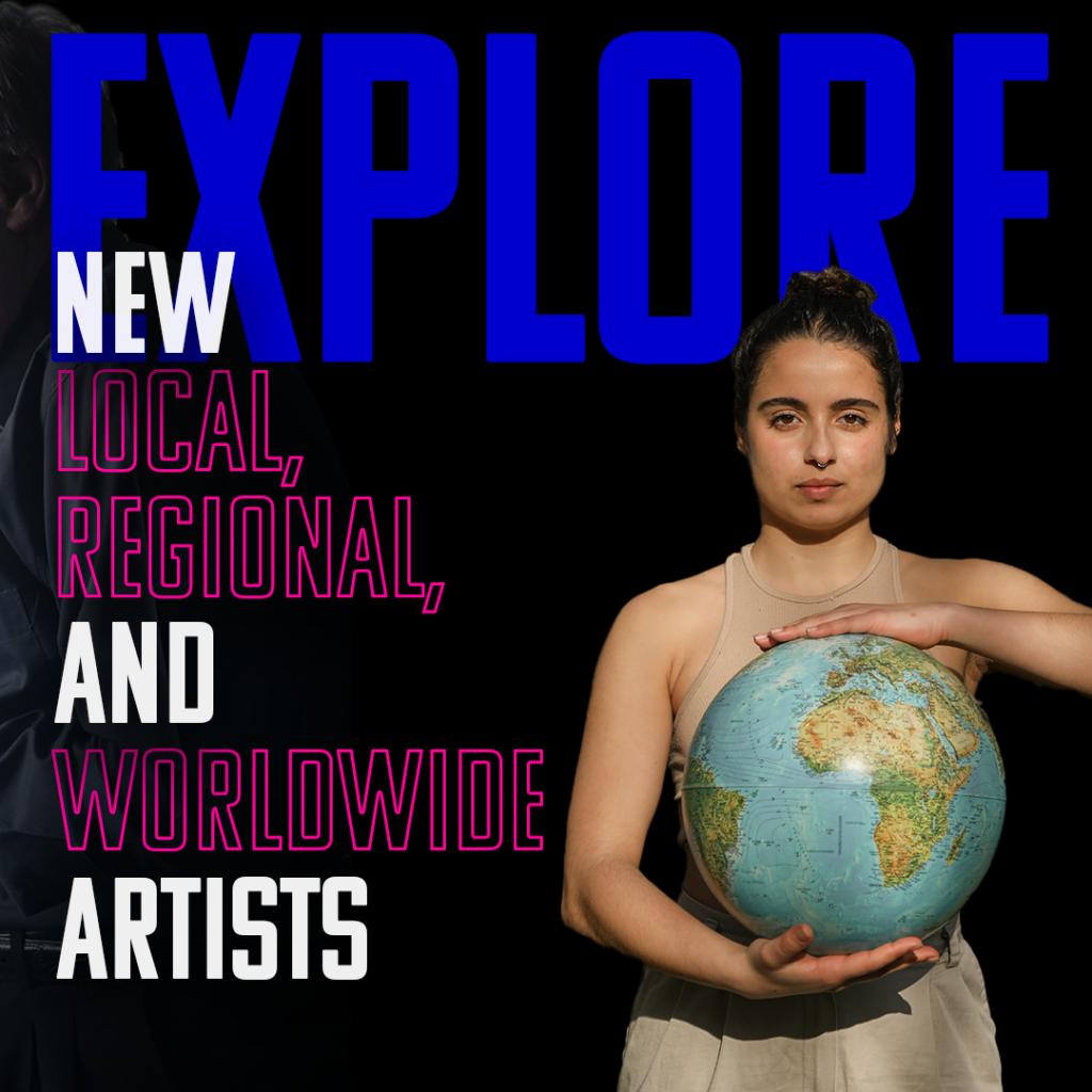
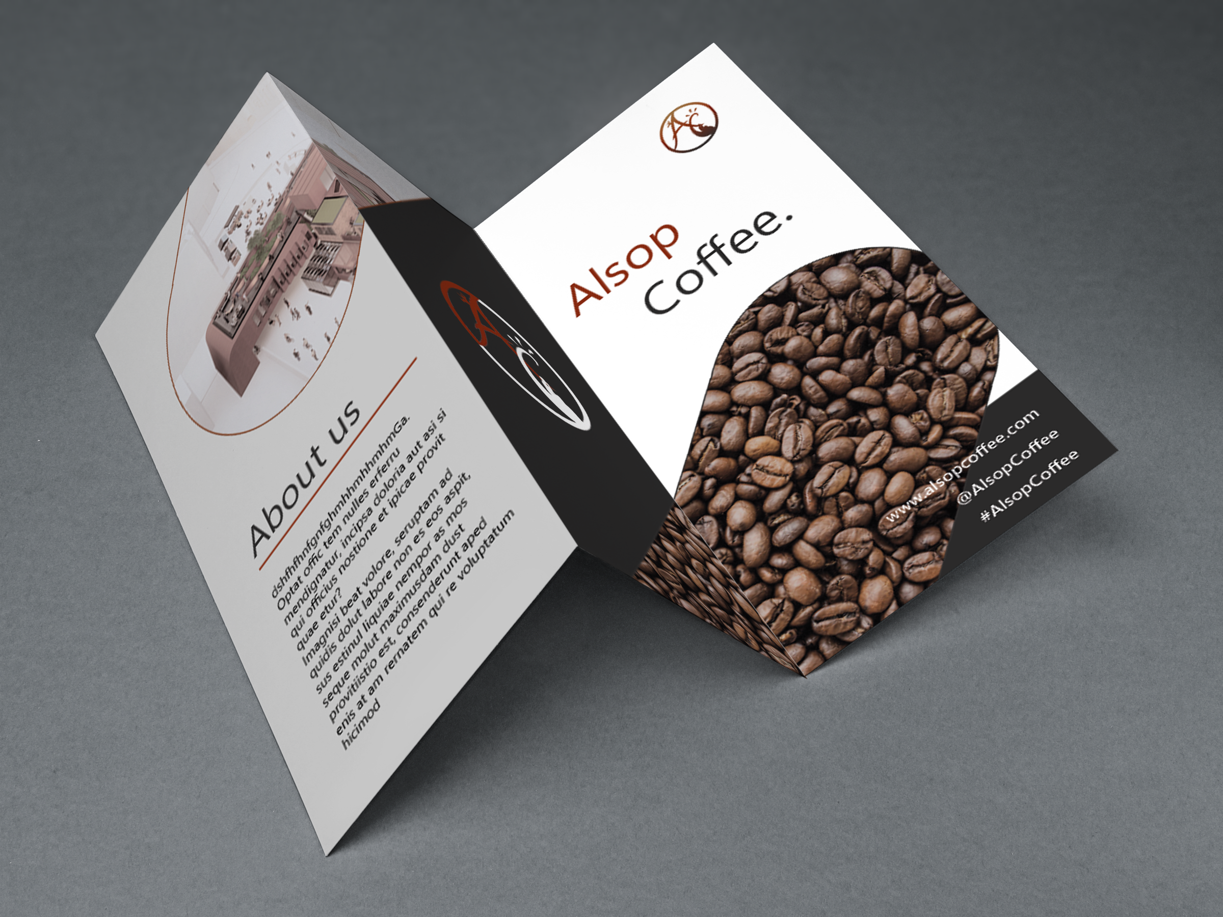
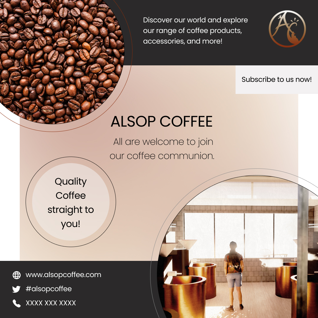
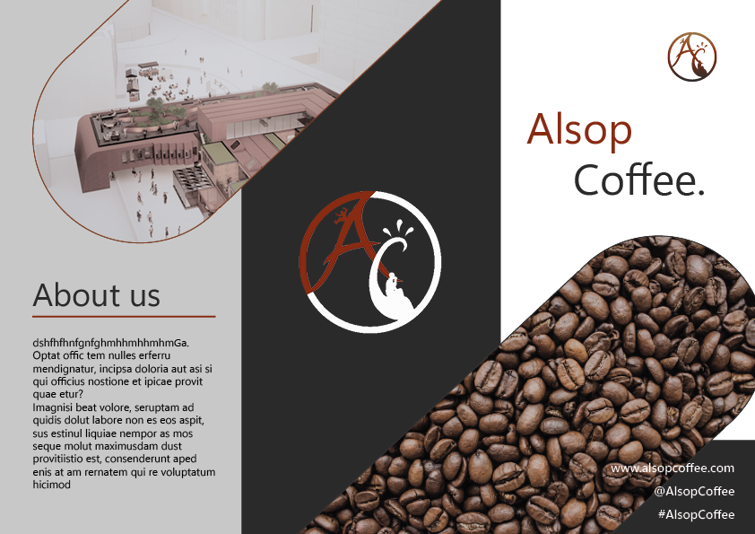
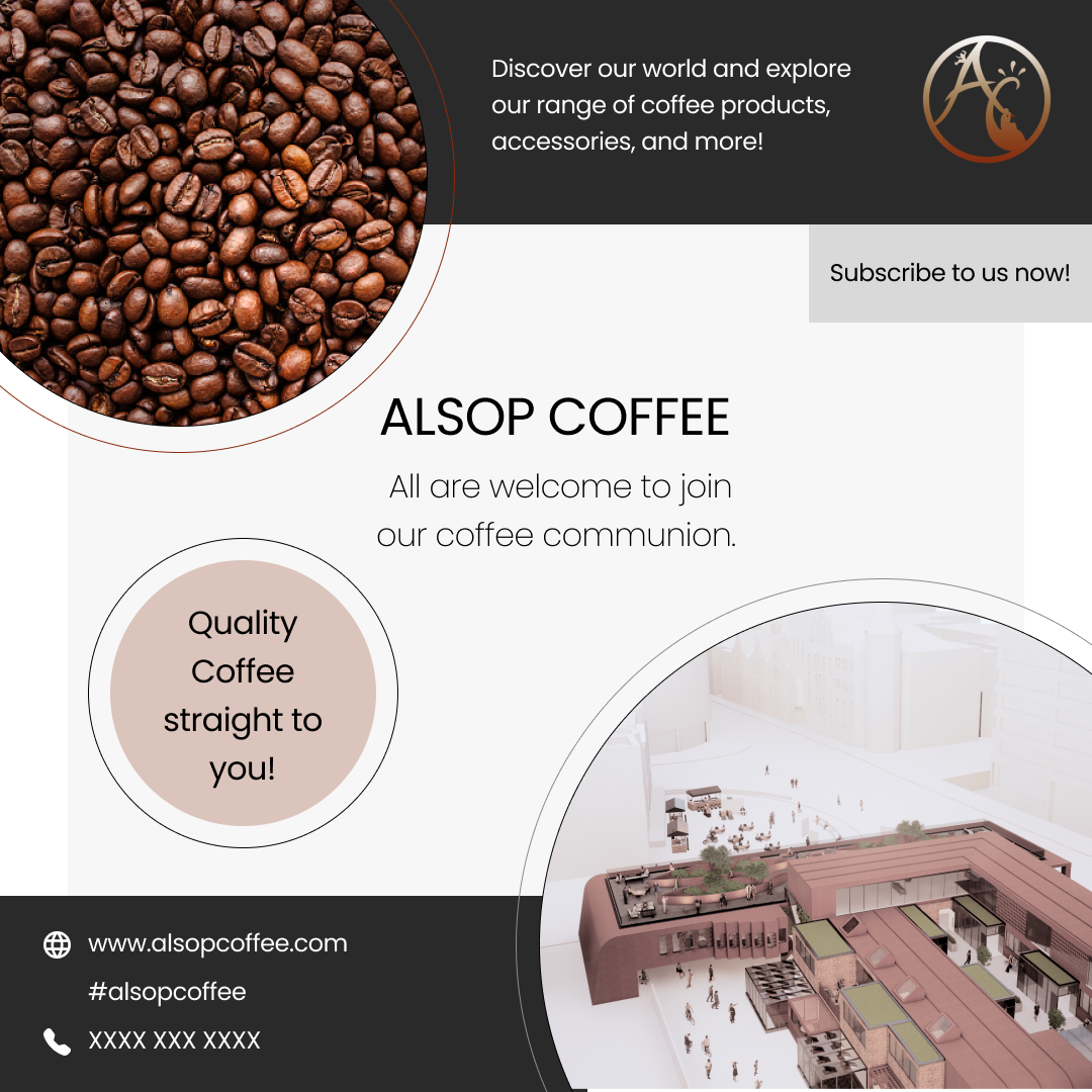
A range of perosnal and client brand designs that I have curated so far
Graphic Design

Odyssey
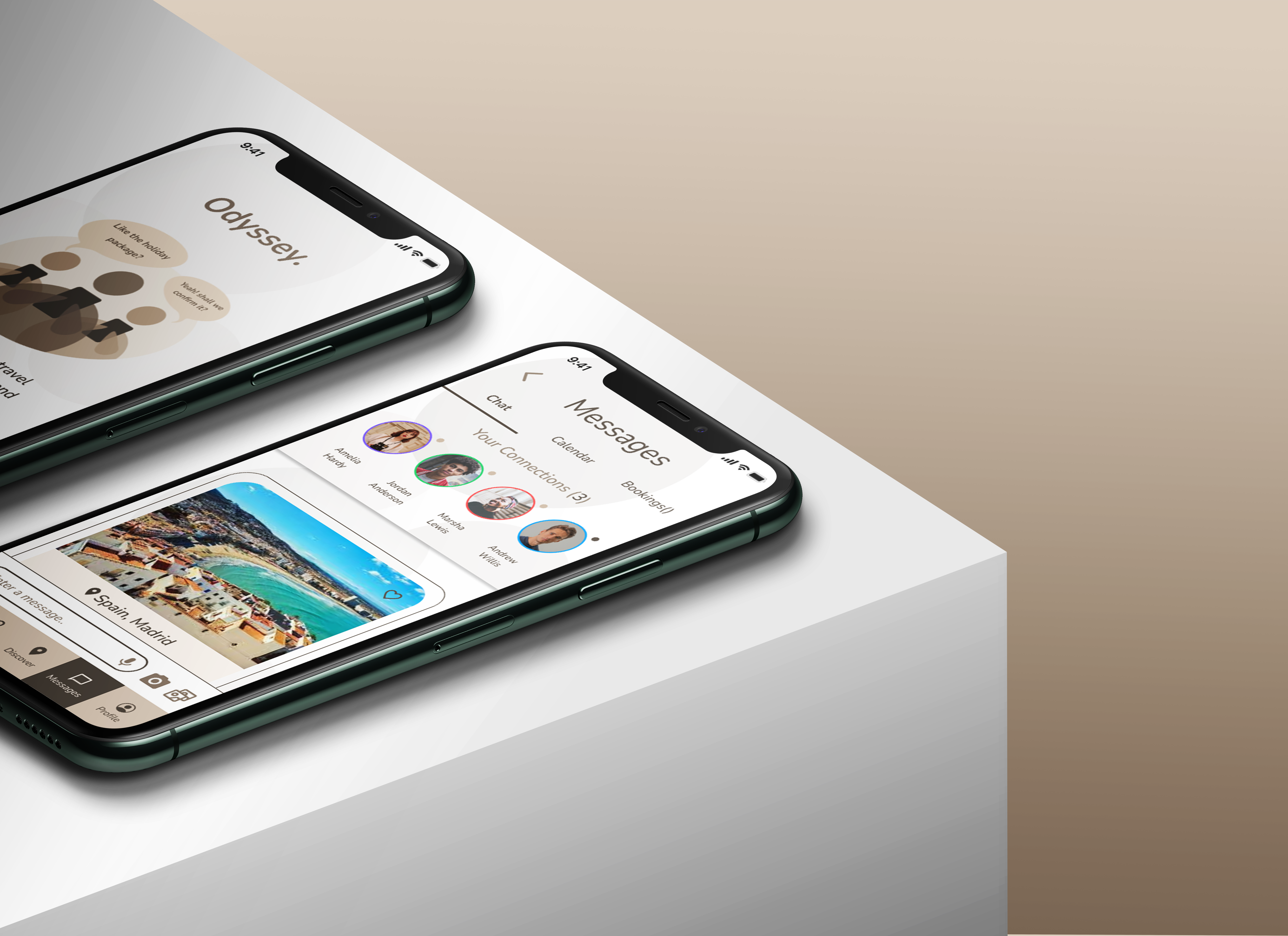
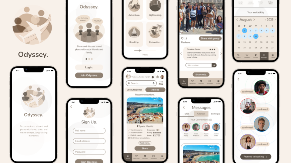
The purpose for this logo was to reperesent and advertise a mobile travel app. This at predominantly focused on group travel, and so I made this an importance to highlight within the logo design.
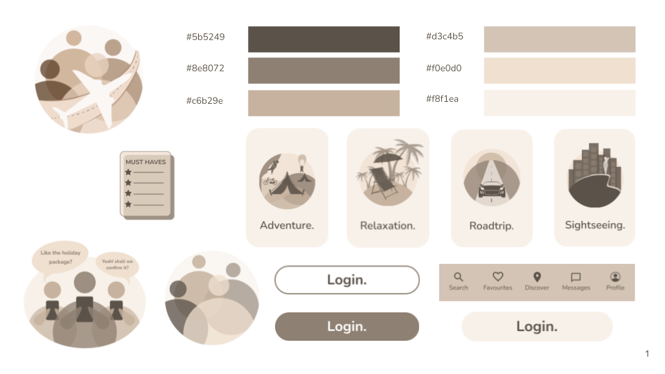
The brown colour palette used reflects the style guide curated for the app itself, mainting the user interface consistency and appeal.
I wanted to keep the typeface simple, readable, recognisable, therefore I explored a few options that I could choose from, and eventually proceeded with the font ‘Poppins’.
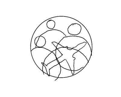
Odyssey Concept Development
From sketch to vector illustration

Typeface Exploration

Challenge
Balancing the opacity of the different colour hued figures of the logo, and maintaining the circular form.
Creative Artwork
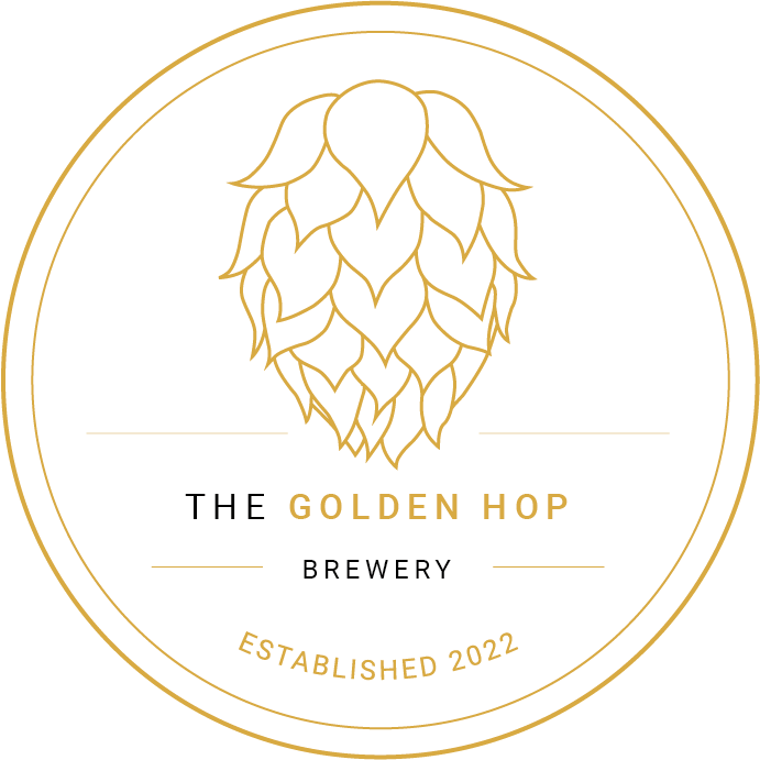
The Golden Hop Brewery
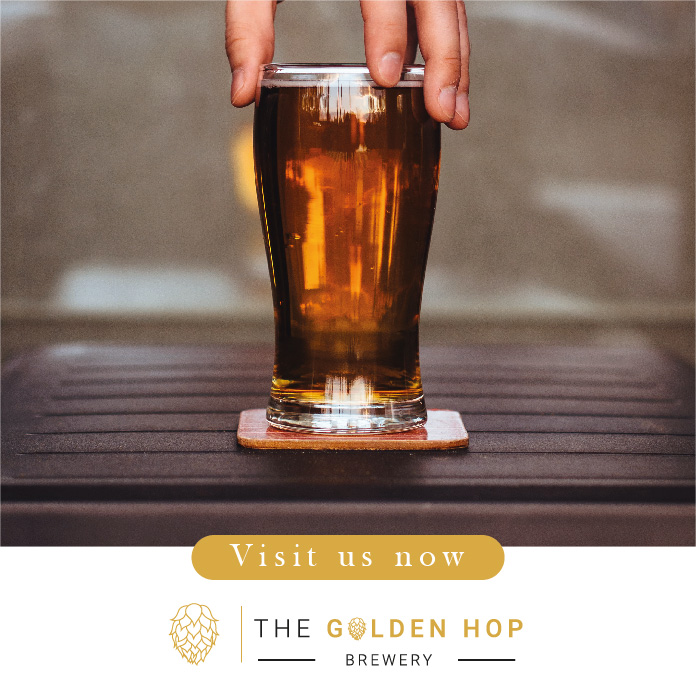
During the concept development process I decided to base my focus on the hop. The hop itself is an essential part of making cider, aswell as its unique shape and pattern. This prompted me to make the hop the highlight of the logo design.
Based on the client brief, the main requirment was to keep the logo somewhat traditional. Therefolre I did a little study between 3 fonts I thought stood out. I knew to keep the text uppercase, because for the prupose of a shop logo, it needs to stand out and be readable from a distance. Additionally emphasising the ‘golden hop’ aspect within a golden contrasting colour, is a unique touch logo, In the end I went with ‘Roboto as my typeface.
Golden Hop Concept Development
From sketch to vector illustration


Challenge
Making sure the golden colour used for the typeface and symbol logo stroke has clarity and is readable.
Creative Artwork
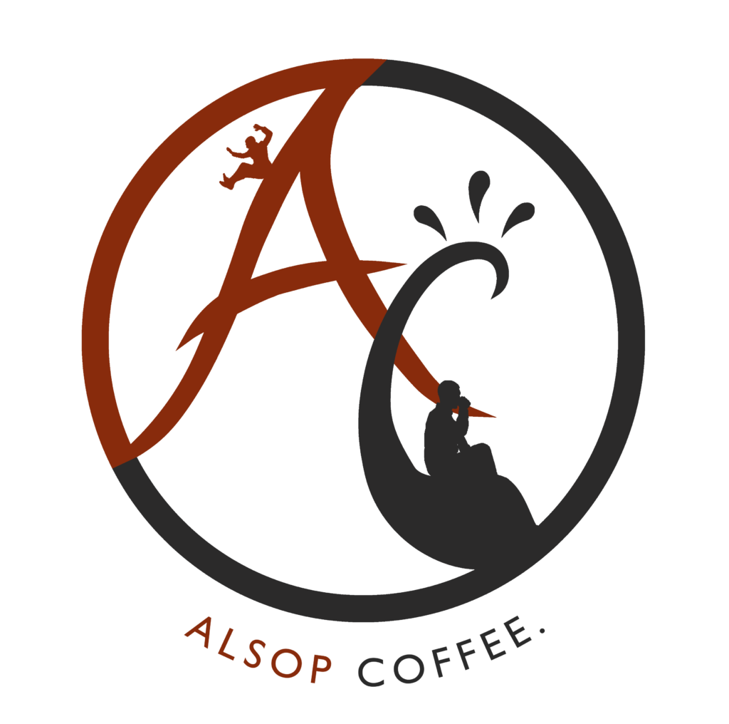
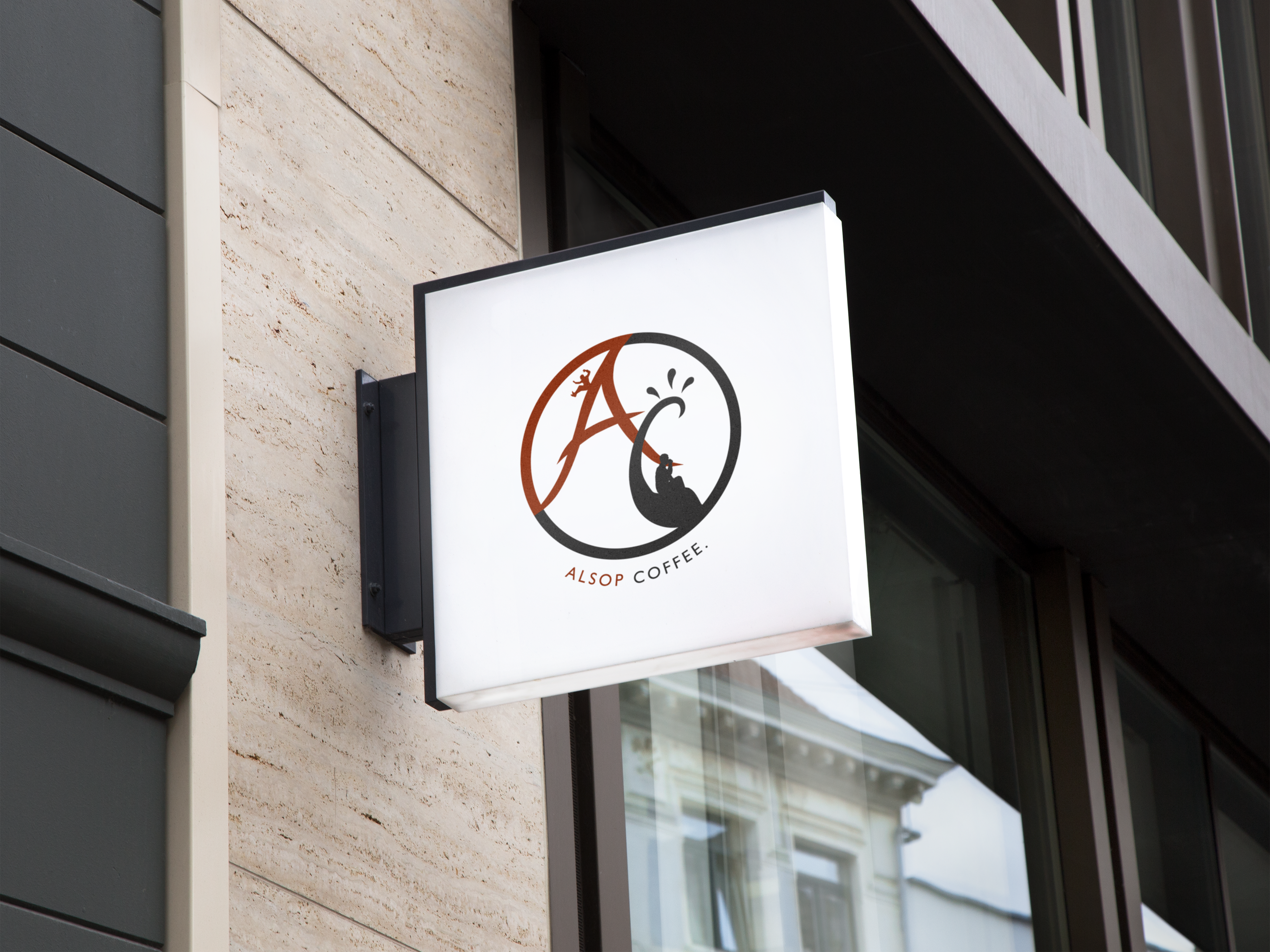
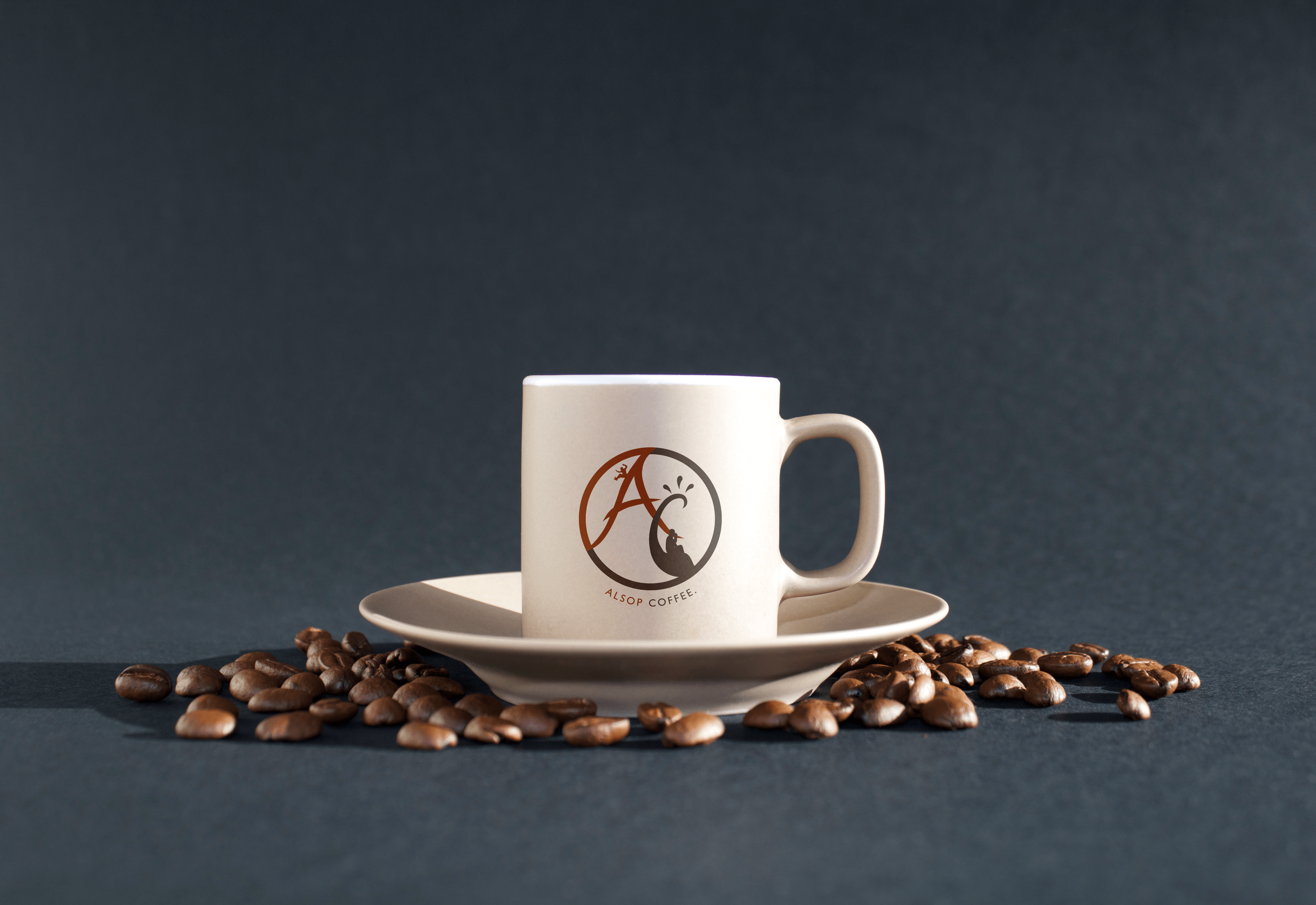
Alsop Coffee
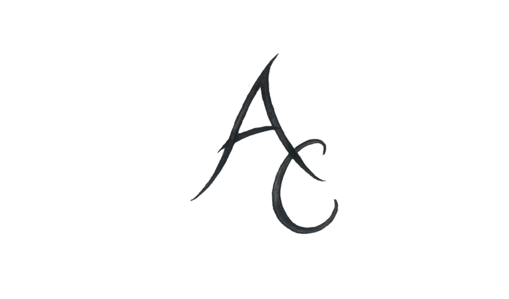
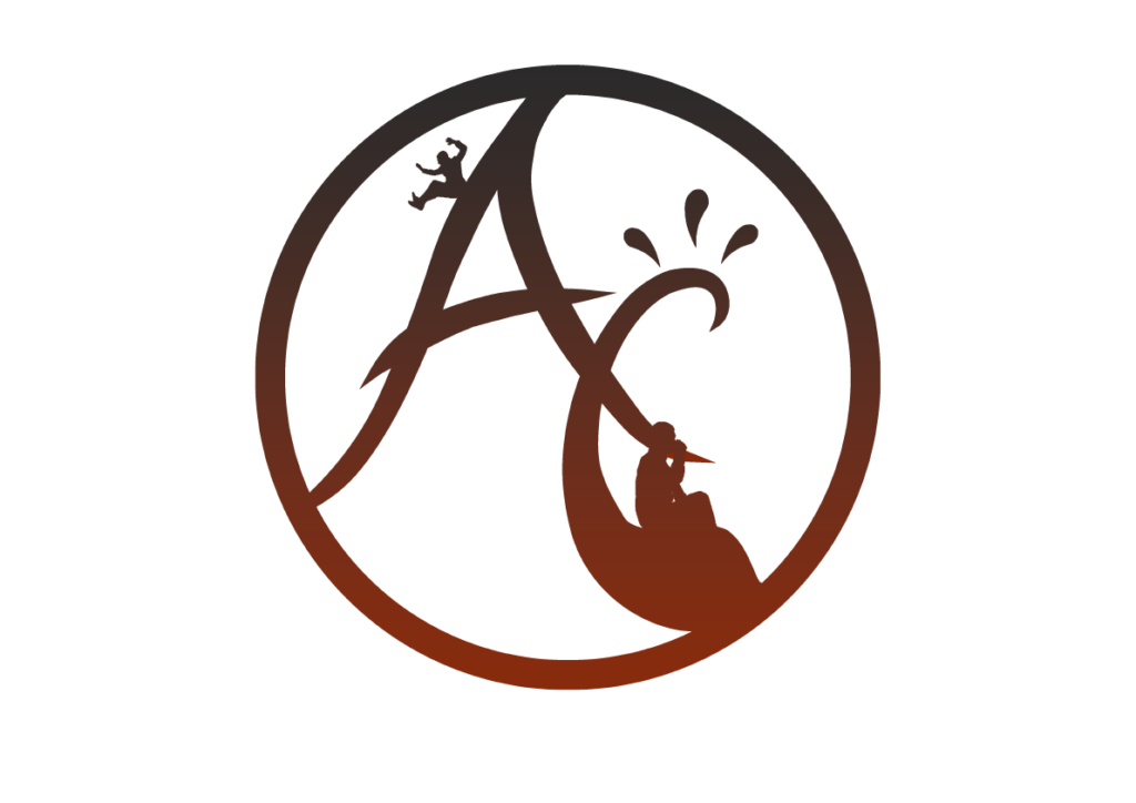
During the concept development process I decided to base my focus on the A + C. This was initially inspired by my prior logo/title for my architectural project ‘Alsop Coffee’, however to make this suitable for a logo design, that is readable and effective, I took on the A + C form instead.
The colour palette used is representative of the colour of coffee.
After much exploration I discovered several logo marks that successfully combined the letter A and C into one unique mark. I wanted to simplify the mark as much. I also explored some use of people to make it more playful .
Alsop Concept Development
From sketch to vector illustration
Challenge
Correctly positioning the human silhouettes with the symbol logo, and also evenly aligning the A + C symbol within a circle.
Creative Artwork
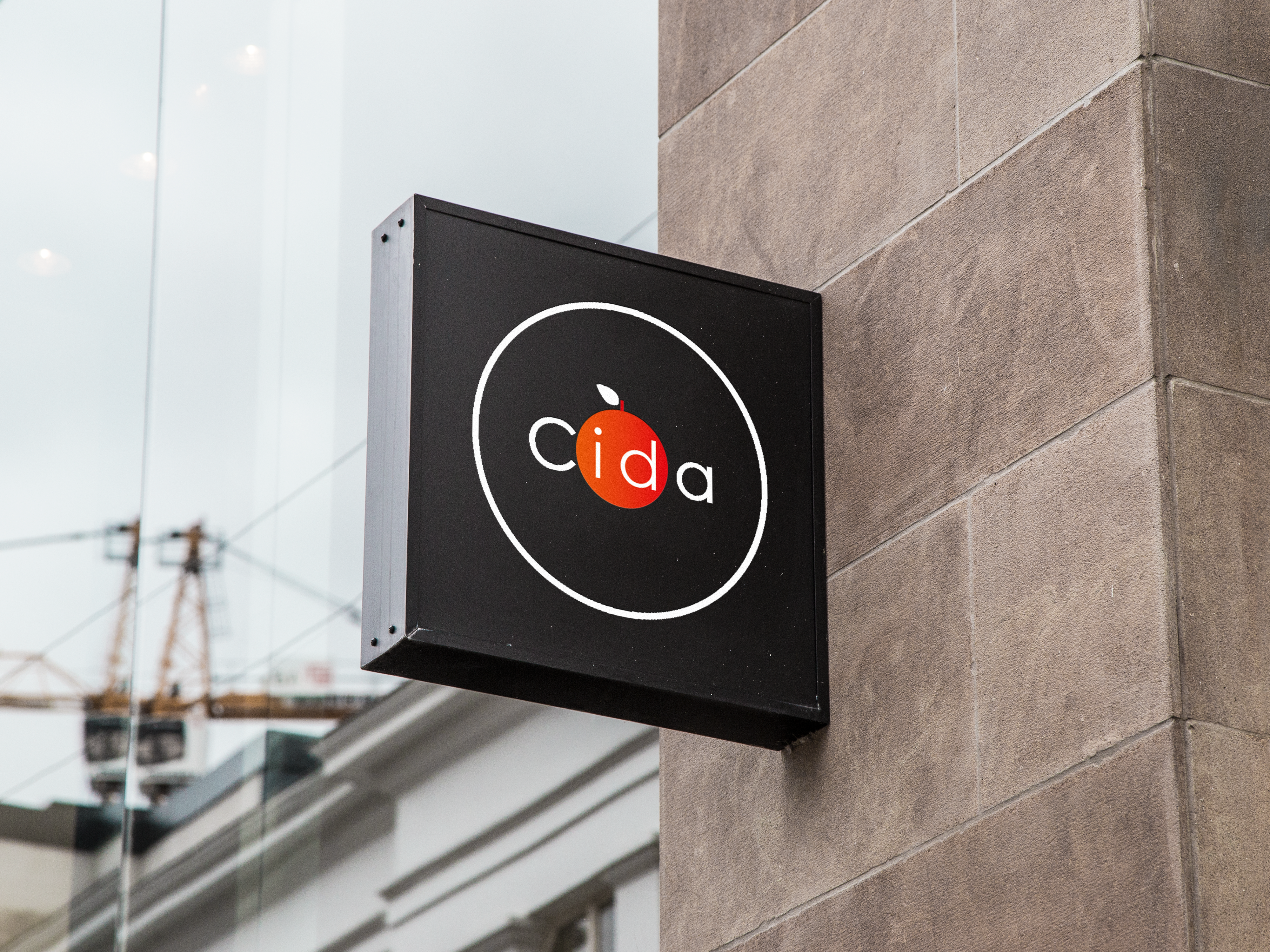
Cida
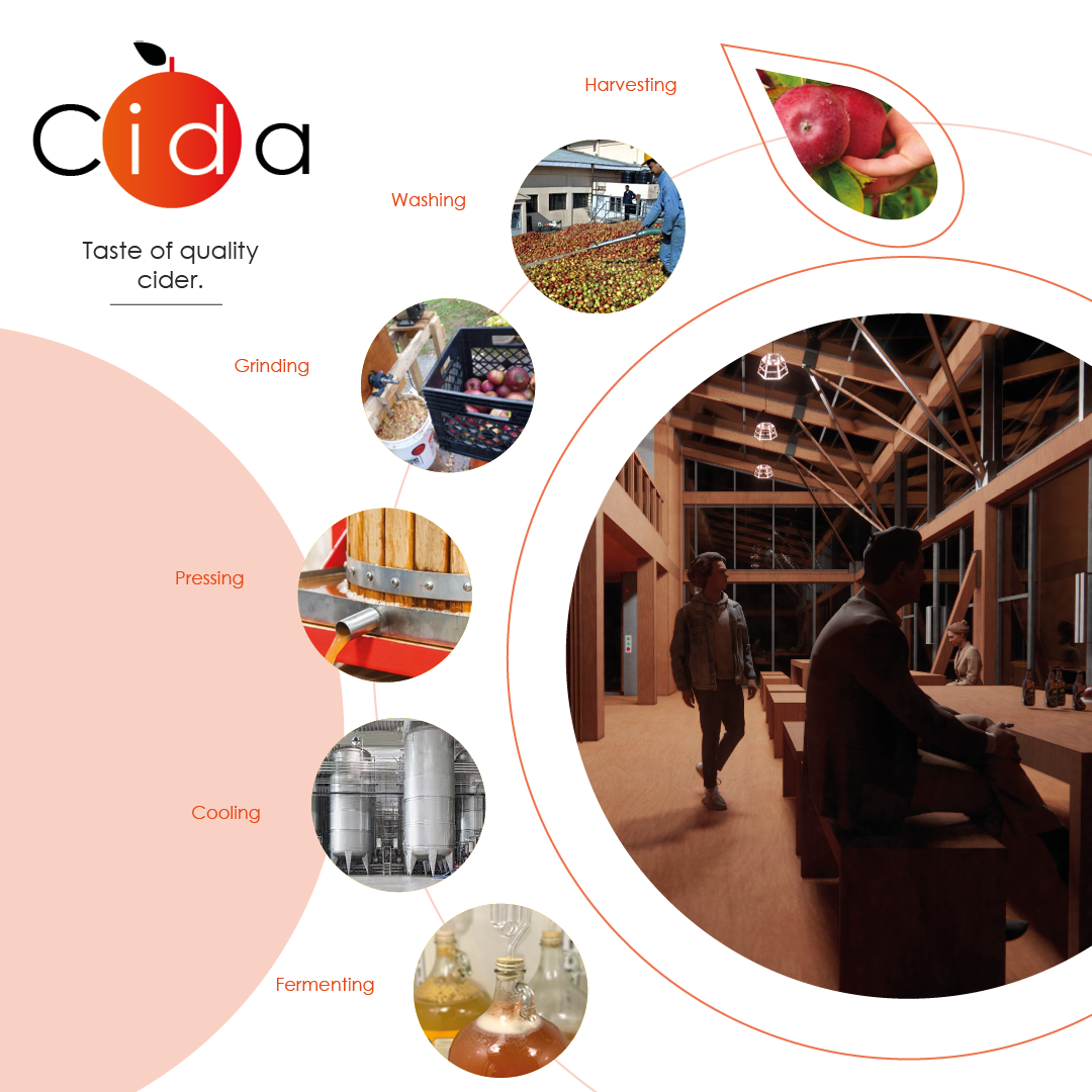
My focus was on the form of the Apple. I wanted the Apple to represent cider , yet not take away from the typeface itself. This logo was insipired by an architectural project of mine that focused on the production and consumption of cider.
As for the typeface , I went with century gothic. It was a simple, spacious modern font that I felt with work well not only as a logo but a brand.
Challenges
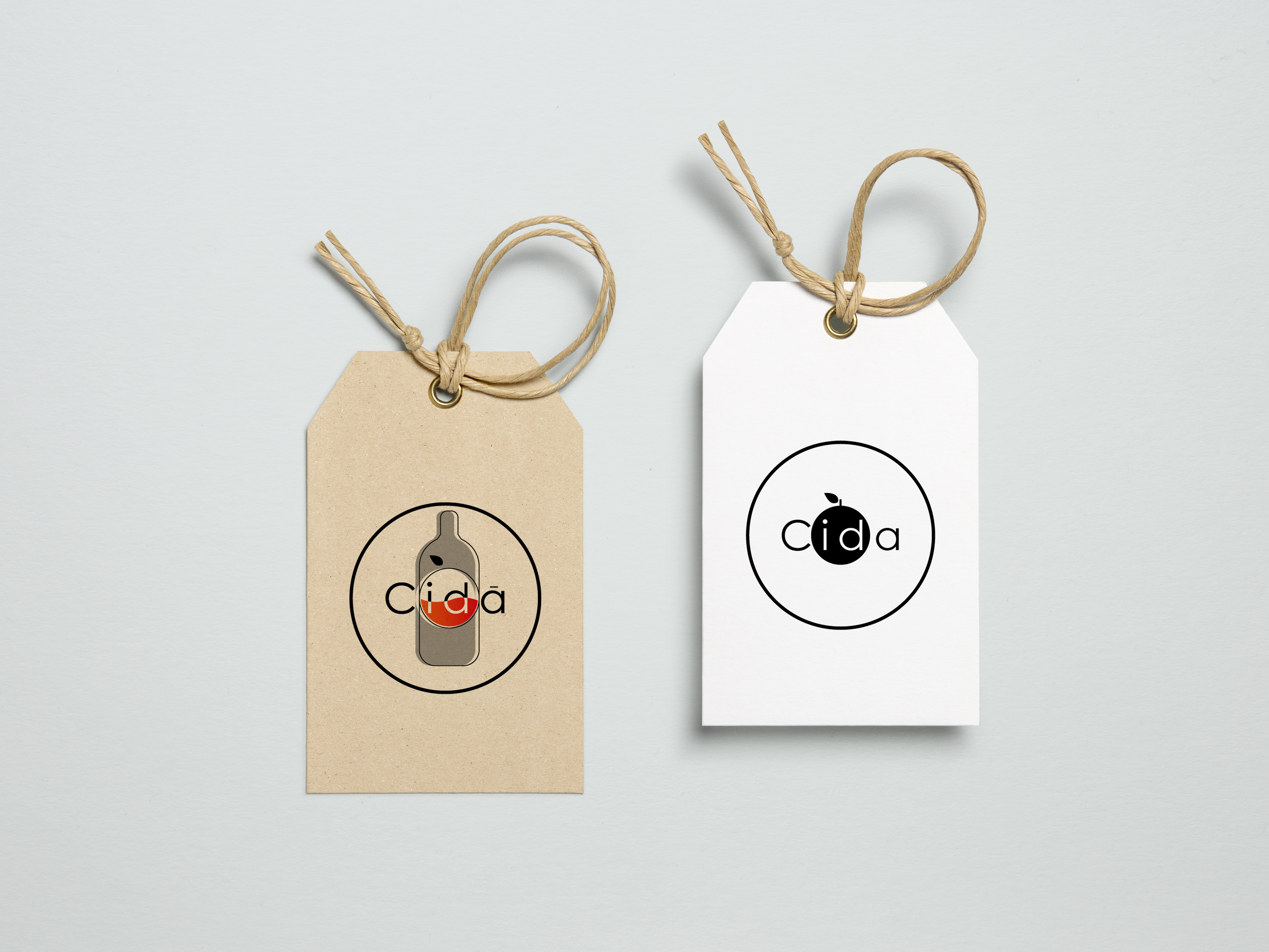
Balancing the cida typeface with the bottle shape, whilst forming a unique but memorable and logomark.
Creative Artwork
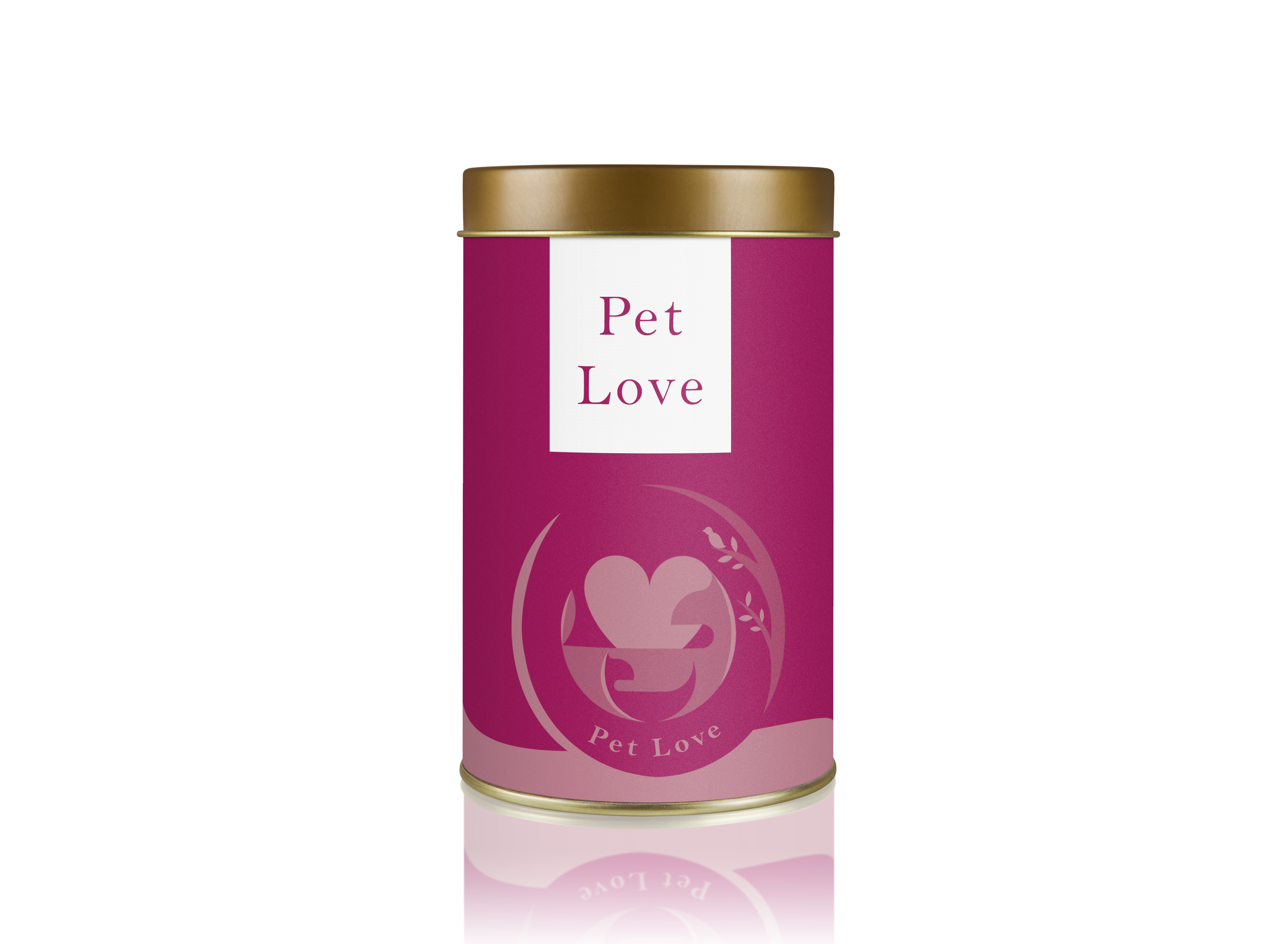
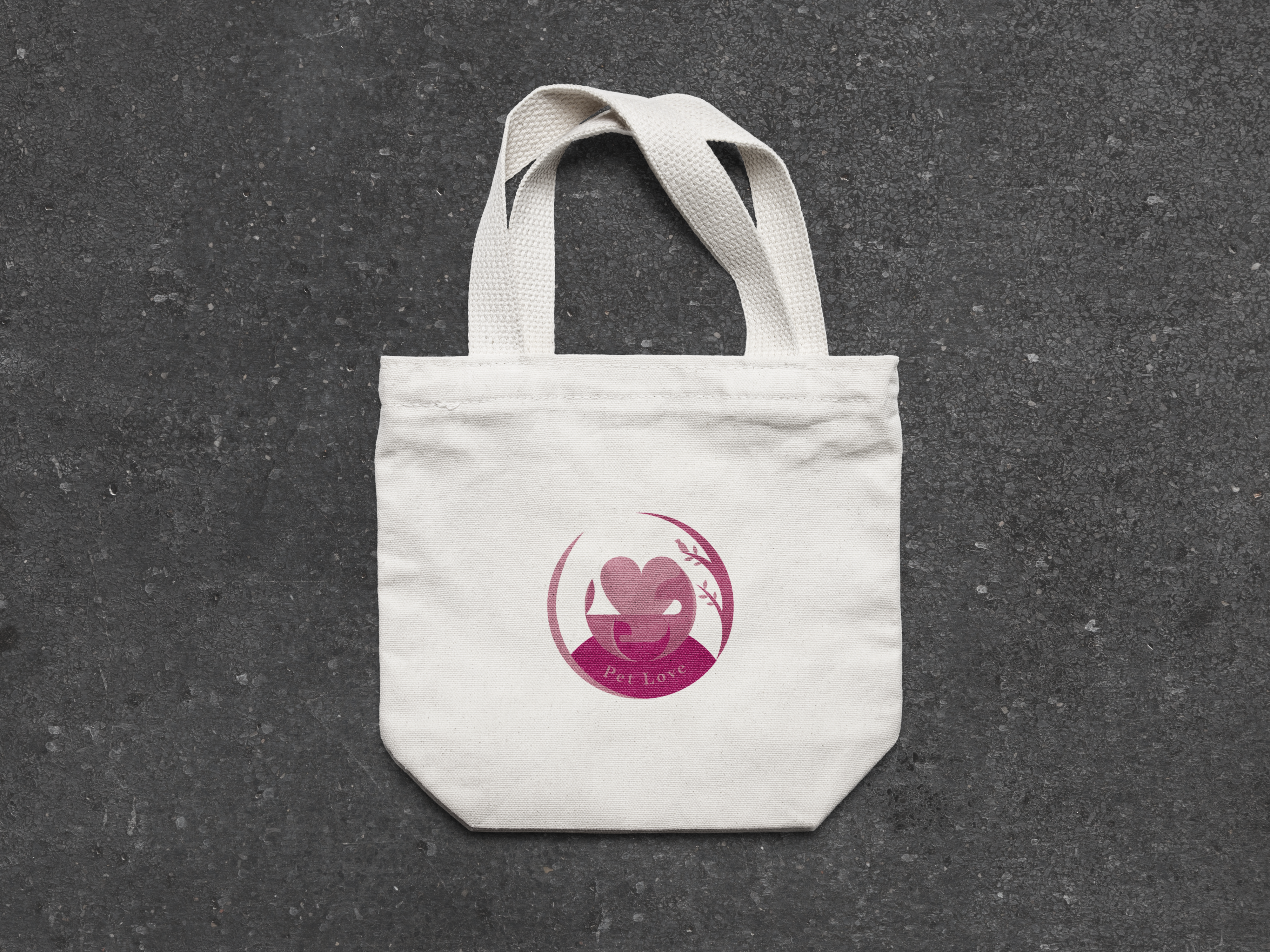
Pet Love
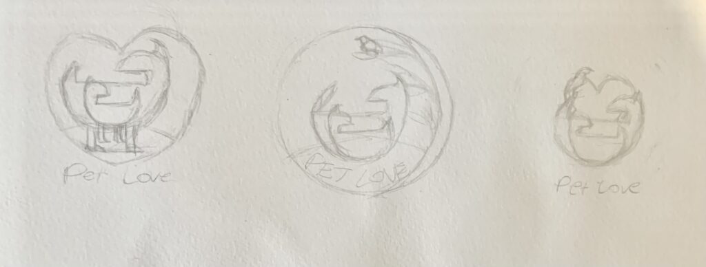
During the concept development process i based my focus on the main two pets; the dog and cat. We as humans all recognise these pets with many of us owning either a dog or cat. For that reason , this familiarity is an essential attention grabber to customers for this brand.
I differentiated the two pets by their tail and size; cat being smaller and dog larger.
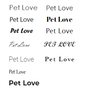
The typeface needed to be simple and gentle , yet traditional, so after multiple exploration of font types , I went with a sans serif bell MT style font. This seemed to work with against the logomark, especially with added spacing between letters.
Pet Love Concept Development
From sketch to vector illustration

Challenges
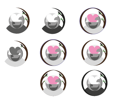
To maintain the clarity and contract between the dog and cat logomark contrast but still be as one .
Typeface Exploration
Design Exploration
Creative Artwork
Pet Love logo animation
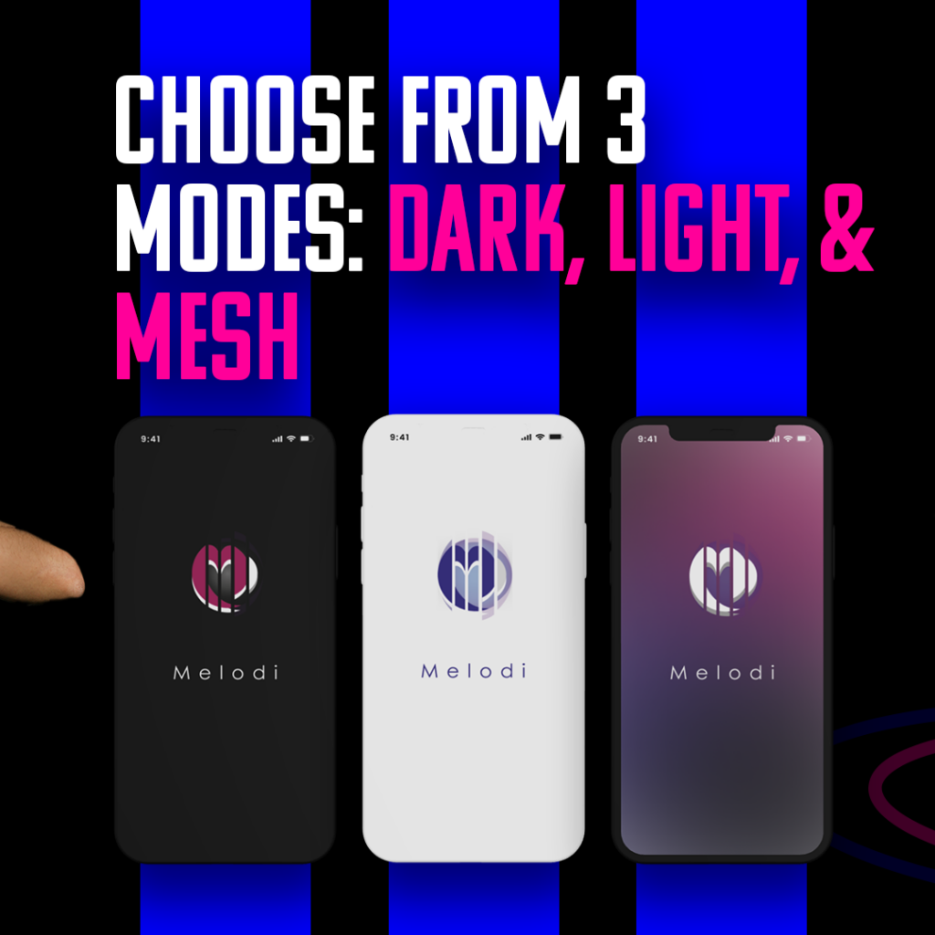
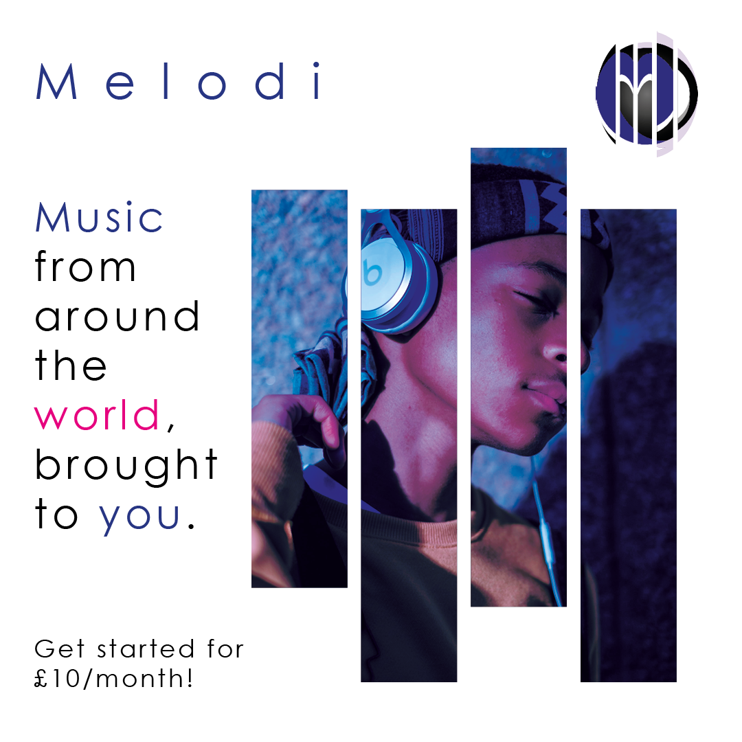
Melodi
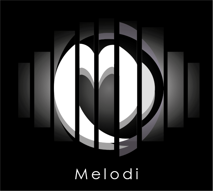
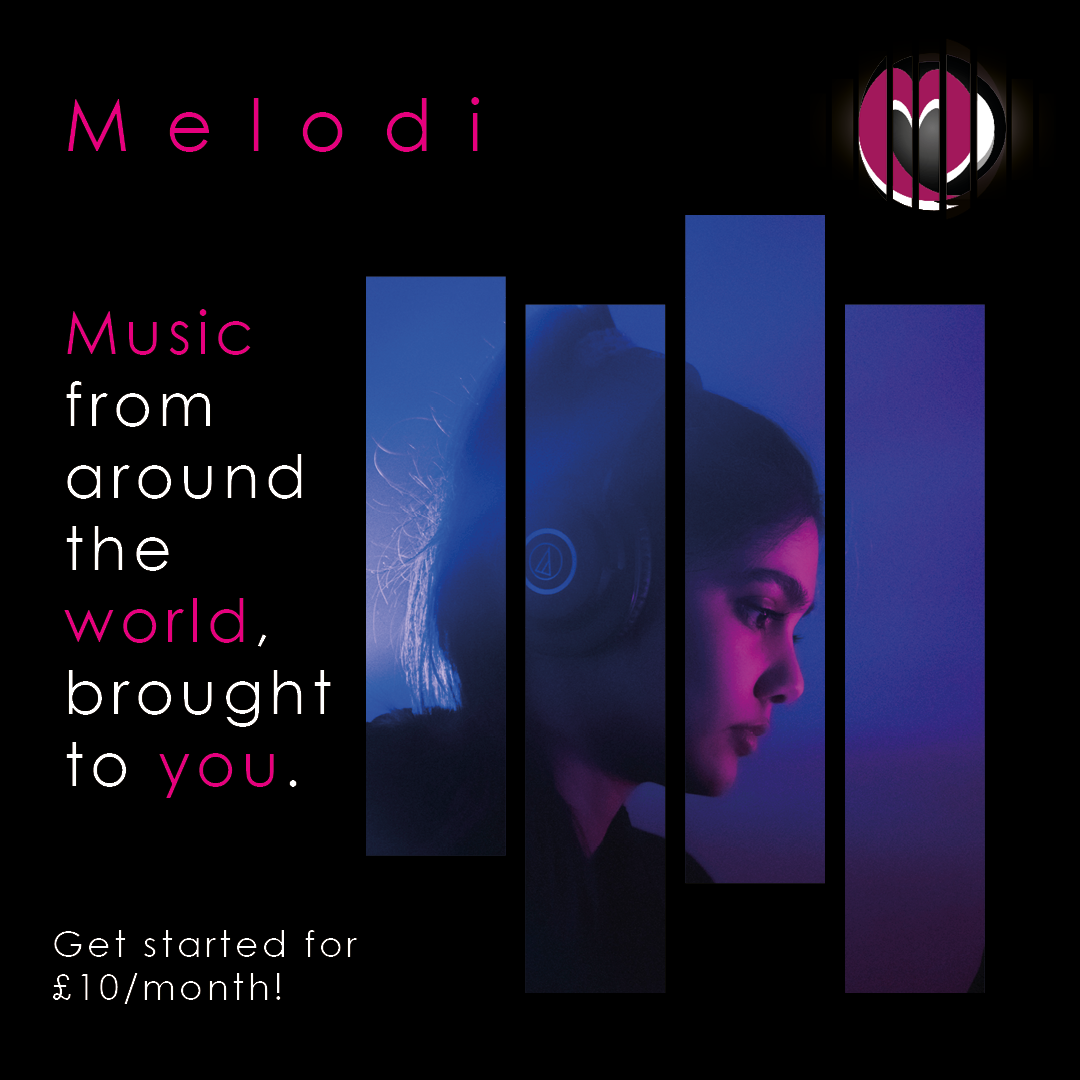
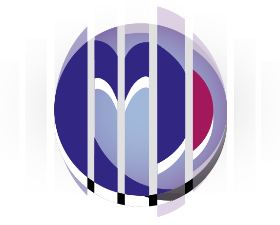
The inspiration for this logo was my passion and love for music. I wanted to design a logo that could be utilised for music label promotions and advertising.
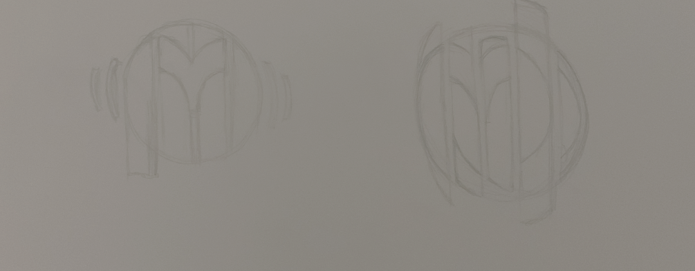
During the concept development I wanted to use the sliced music volume bars to creatively form the M letter of the logo.
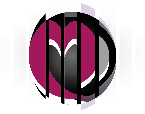

Melodi Concept Development
From sketch to vector illustration

Challenges
Making the ‘M’ for melodi a unique form that reflects music aswell as it’s own identity as a new music platform.
Creative Artwork
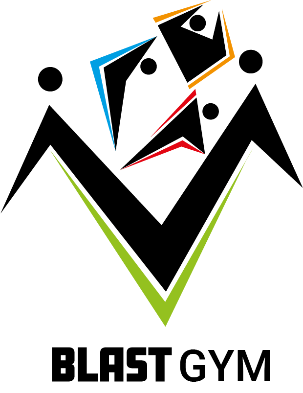
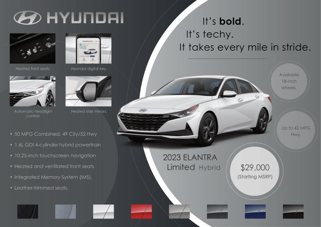
Other Creative Artwork/ Logos
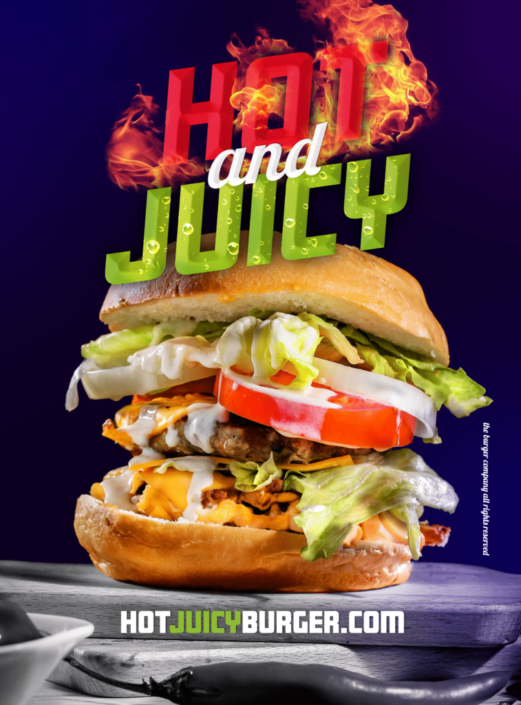
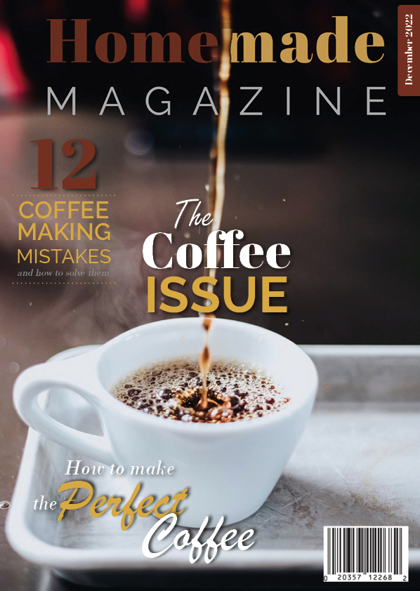
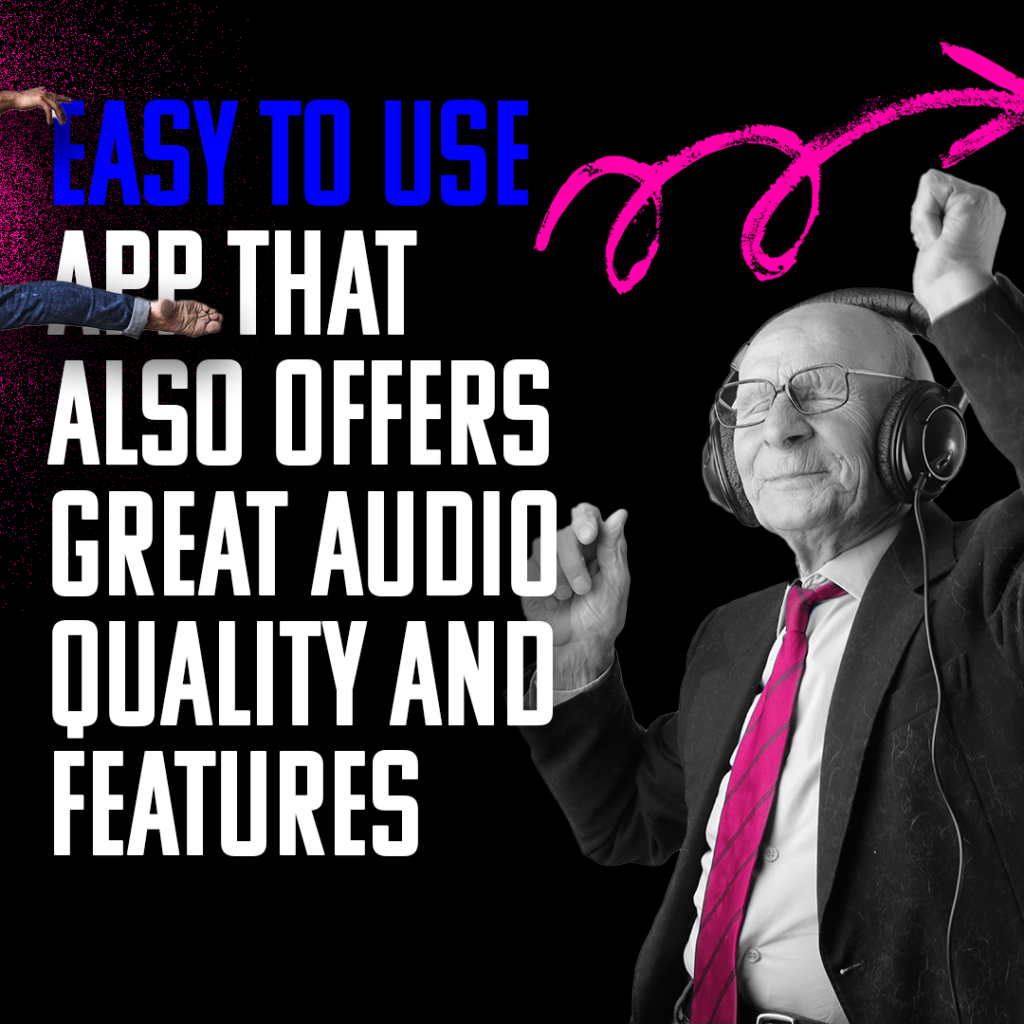
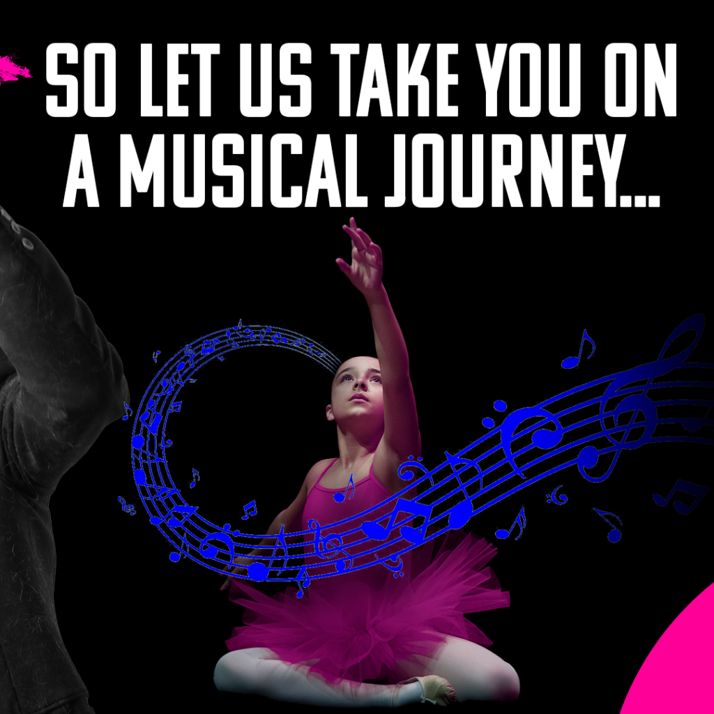
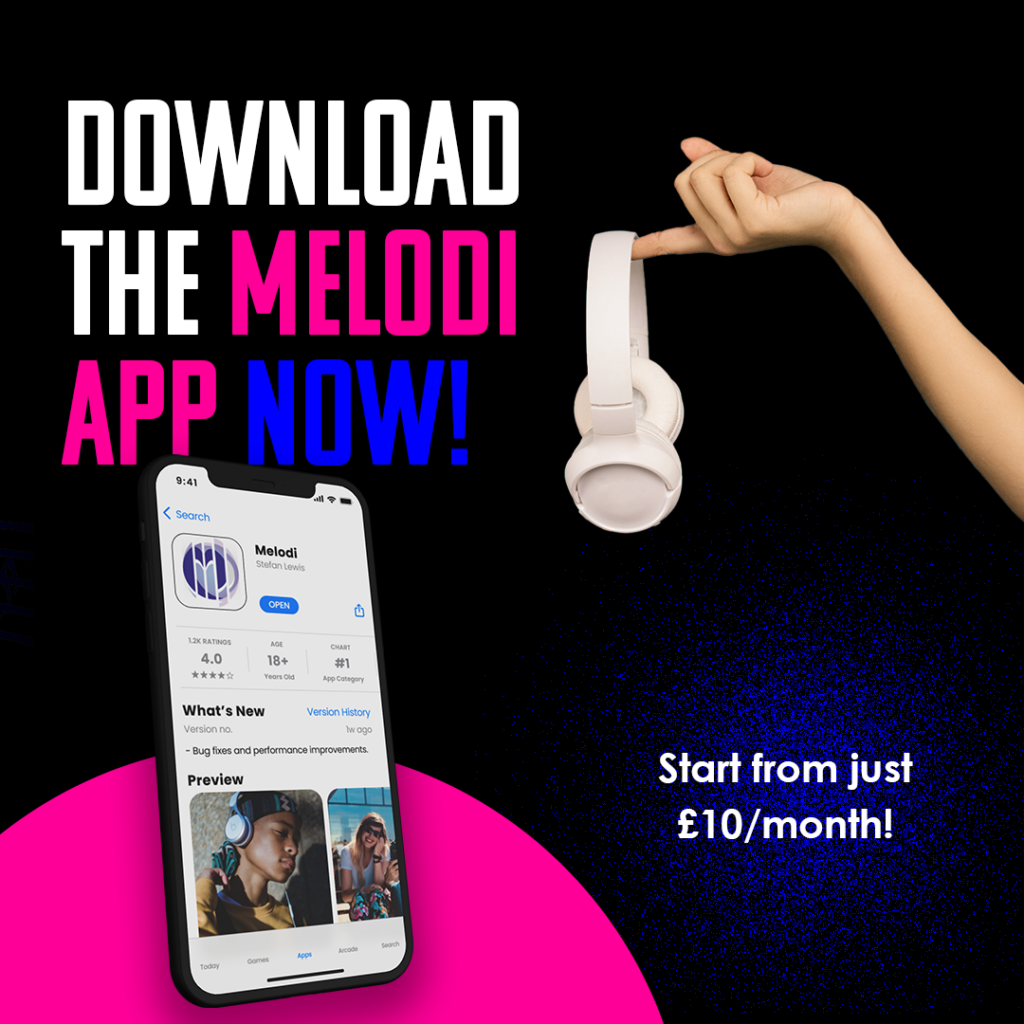
Instagram Carousel
