Role: UX/ UI Designer
Proposal: Odyssey Travel App
Sector: Tourism & Travel
Tools: Figma, Adobe Illustrator, Miro, Google Drive
Duration: 5 weeks
The problem: People are struggling to discover and discuss travel plans with friends, that considers their budget, availability and interests.
The solution: connect and share travel plans with loved ones, and create unique, long lasting memories.
Project Overview:
I have been tasked by Odyssey, the travel agencym to create a new mobile app that improves the travel planning experience, by addressing user needs and issues with empathy, insight and intuition. It will be targeted towards group travellers, who would like to discuss and share travel plans collaboratively. Despite this being an app predominiantly for group trips, the client would still like for the app to accommodate all users and trip searches.

‘Connect and share travel plans with loved ones, and create unique, long lasting memories.’
Problem Statement
How might we expedite the travel search and booking process, so that young travelers are no longer discouraged to make travel plans?
Design Process
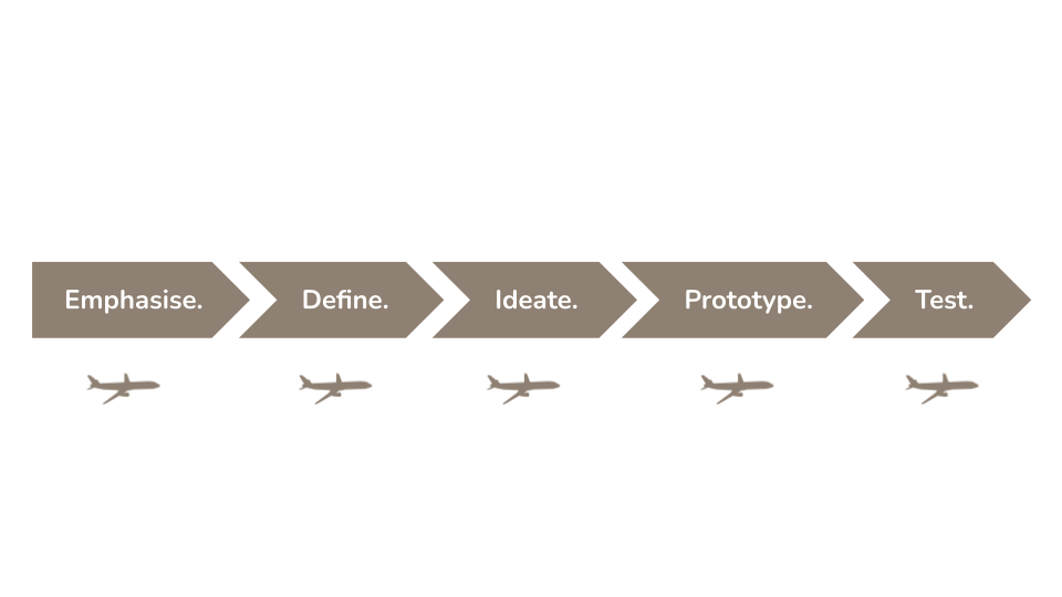
Research
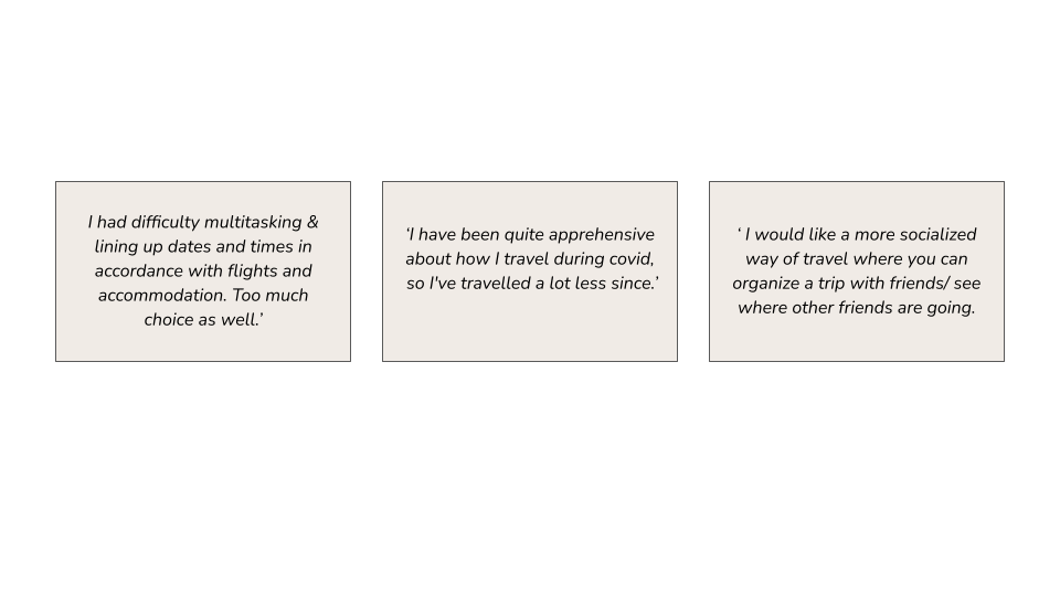
User Insights
I want to understand how travelers make decisions on the best locations to visit and how the search process could be made simpler and more efficient. I began by conducting user 5-6 interviews in order to disclose their travel experiences. I discovered that there was a high priority on travel budgets. I also surveyed 5 additional participants, ages 20-35, who on average traveled 1-2 times per year, and mostly enjoy sightseeing.
Define
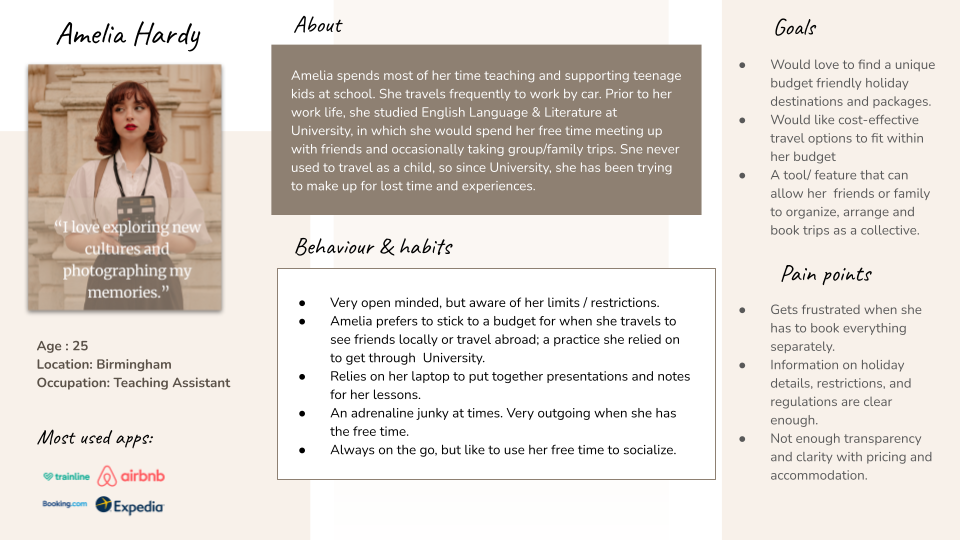
User Persona
Based on the results of my affinity diagram, I delineated an empathy map, and selected the most prominent and important statements. Understanding the user’s emotions, thoughts, behaviors, and pain points, would help construct and better inform the intended user of the app.
Ideate
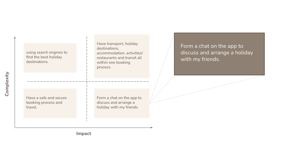
Feature Matrix
After a dot vote, the statement shown above, will be the main feature and priority for the travel app. Its high complexity and low impact status insinuates that it’s highly sought after by my prospective users and should be attainable to implement.
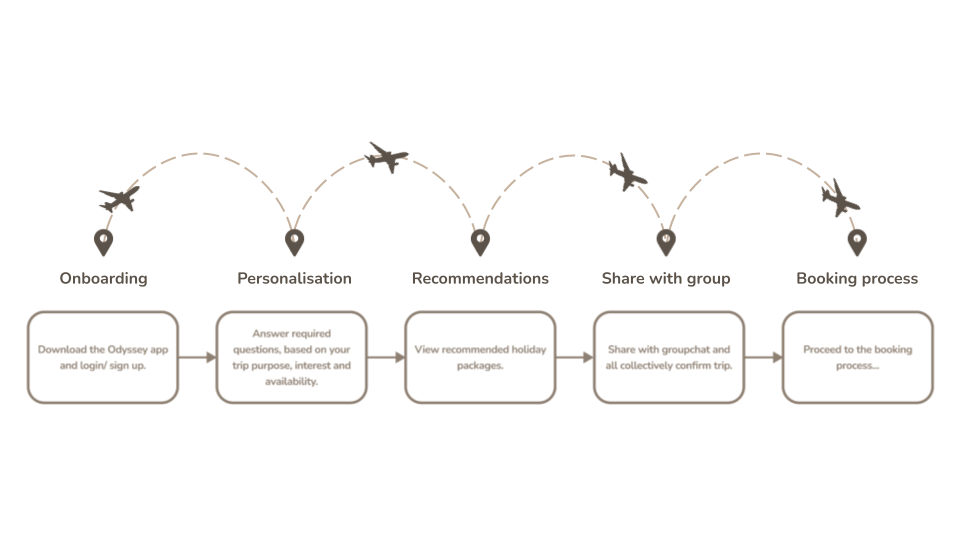
Task Flow
Obstacles & Challenges
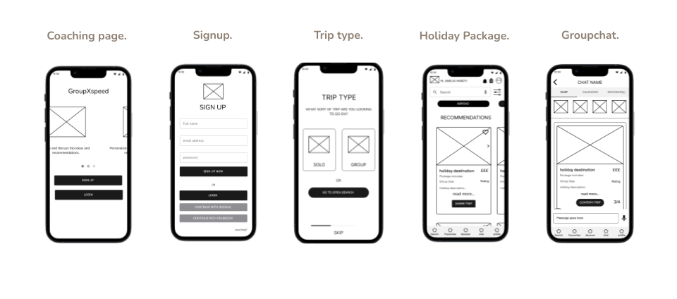
Despite this app being target predominantly towards groups of friends or family, I would still like to accommodate for those wanting to venture on a solo trip and also search freely from scratch without perosnalisation. I struggled to accomodate for this use as my user journey’s focus is on group trips. To resolve this, I included a selection for solo trips, aswell as the option to conduct an open search for holiday packages.
Prototype
Low Fidelity Wireframes
Obstacles & Challenges
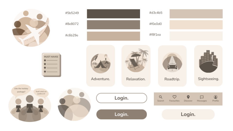
Curating a style guide for this product was difficult, as I wanted the theme to come across both neutral and adventurous. So, I took inspiration from my direct competitors; Gaffl and Airbnb, and for my style I applied their use of complentary colour amongst a clear background, and round-edged components. This was so the clean yet modern and and interactive design would appeal to my target audience of 20-30 year olds.
Style Guide
Test
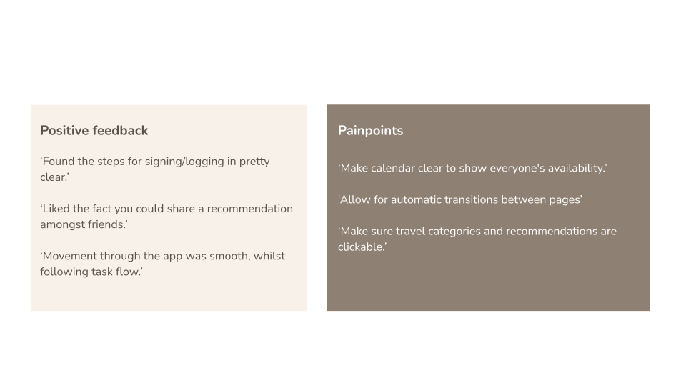
Test Feedback
Before making amendments to my digital wireframe, I conducted 4 user tests, in which I received both positive and negative (painpoints) feedback. Thankfully the feedback I received was mostly positive! There were only a few iterations to be made to the wireframes.
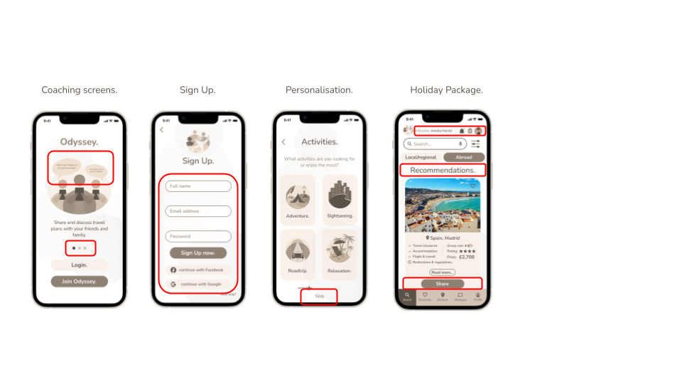
Iterated Wireframes
Highlighted in red are the changes/modifications to be made to the app after user testing of the HI-fi prototype.
- Readable coaching pages that users can select to re-read what has been displayed.
- Evenly space input boxes and buttons.
- The ‘next’ button drives users to complete each personalisation question, as doing so would improve the search results.
- Modifications made will improve the user experience through the app.
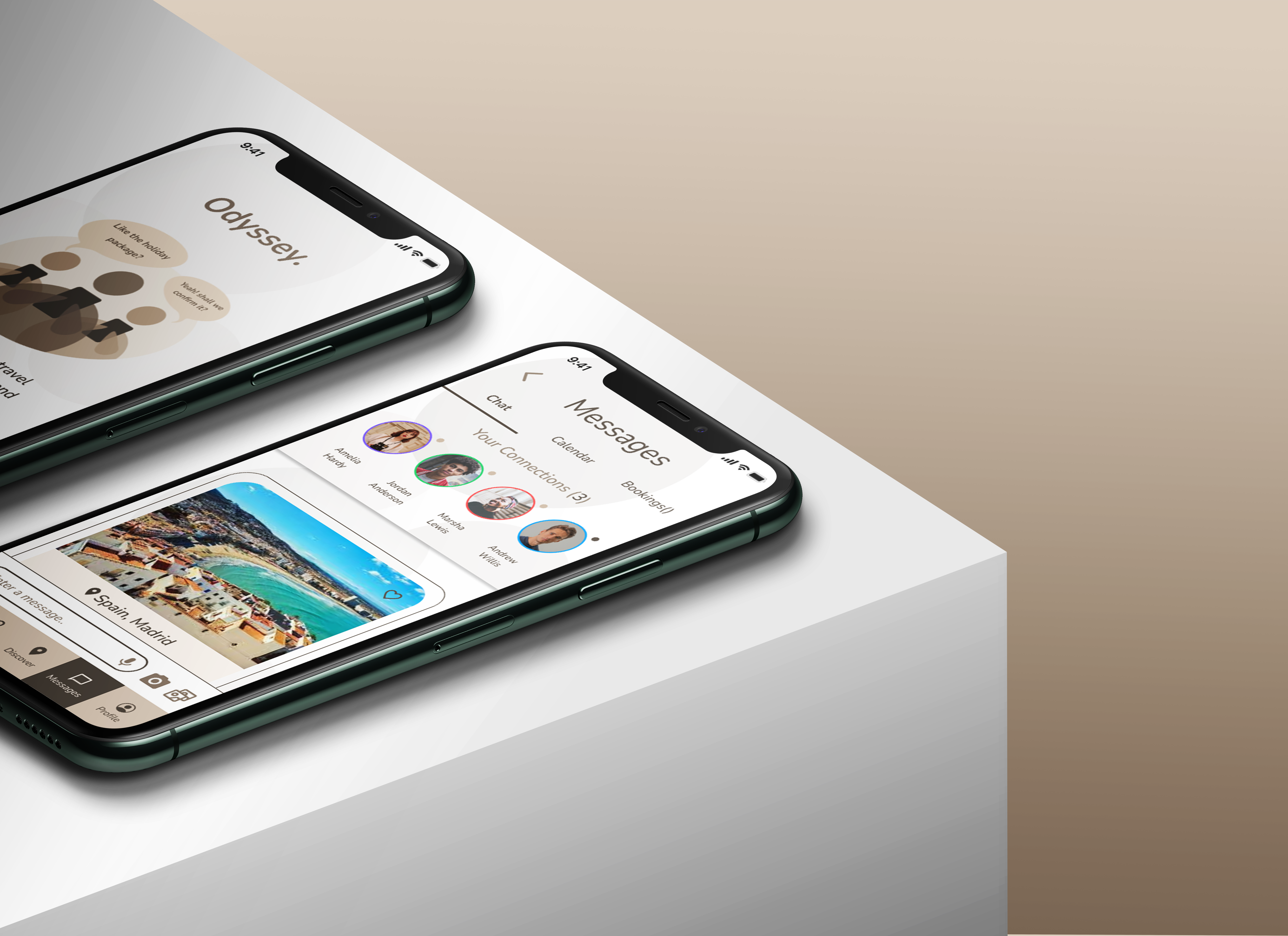
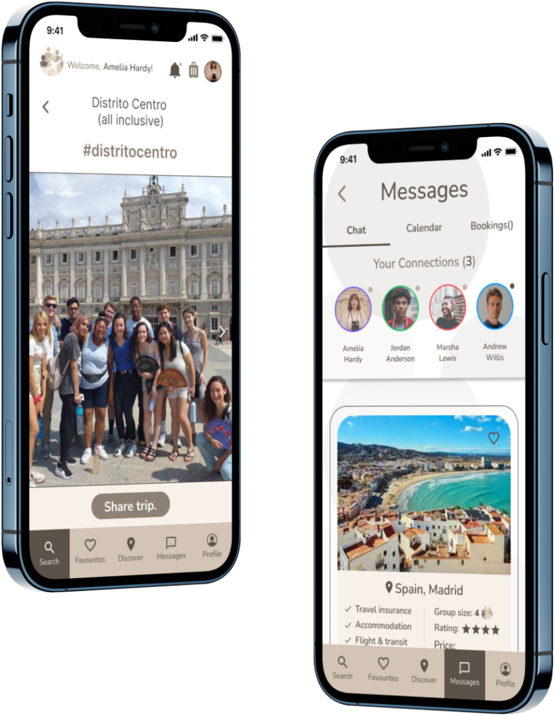
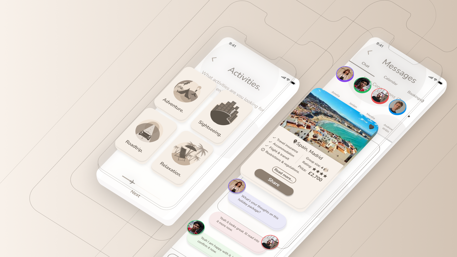
Groupchat Feature
Users are able to select, review, and share their holiday packages with their friends via the groupchat.
I presented this feautre concept with the client,as it was innovative and not widely implemented within most current travel apps.
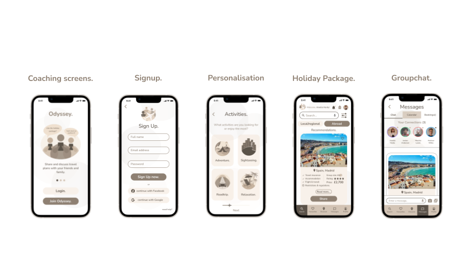
High Fidelity Wireframes
Conclusion
Overall the client was happy with the outcome of my end product. I was able to confidently and consistently follow through with each phase to create a travel app with a thorough and interactive user experience.
I also designed and illustrated my own logo, and images on this app which I found challenging yet interesting and successful.
What I would have done differently
To diligently utilise my user test feedback to influence the development of the prototype.
Allow users to share their availability via chat, instead of everyone member of group having to individually go through each others calendar.
To make sure I doubt check clickable prototype is functioning correctly.
I would like to implement a ‘booking process’ feature to complete the holiday booking on the app.