Role: UI Designer
Client: US Department of Agriculture
Sector: Government Services
Tools: Figma, Maze, Adobe Illustrator
Duration: 5 weeks
The problem: The current website interface lacks character, a seamless uer journey and call to actions seem quite discouraging to new users.
The solution: A user-centred responsive website redesign that focuses on improving usability, engagement, and navigation for users of the website
Project Overview
I reached out to USDA (US Department of Agriculture) and offered to resdesign their website. Despite my initial view of the site and noticiting many UI issues and changes that need to be made, stakeholders stated that they were struggling to attract new and cosnsistent viewers to the site. Customers struggle to navigate the website via the navbar and simply identifying pages/ external links. My aim is to rebuild a high quality, engaging, diverse and visually stimulating user interface that represents the brand and users of the site.
UI Analysis
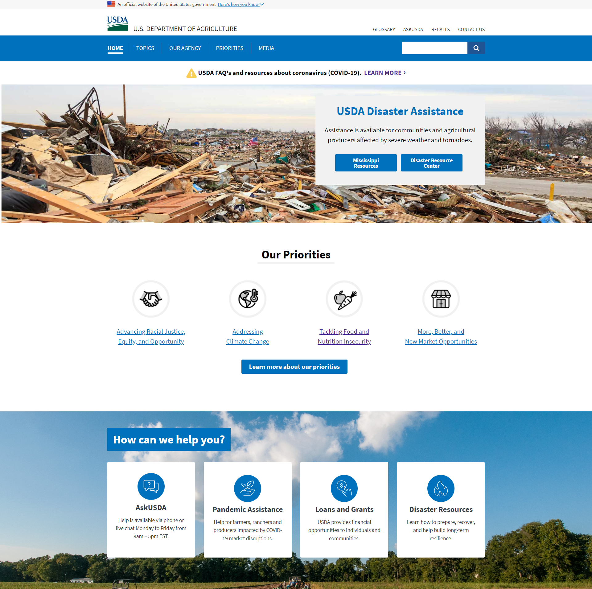
Current Desktop Homepage
Heuristic Evaluation
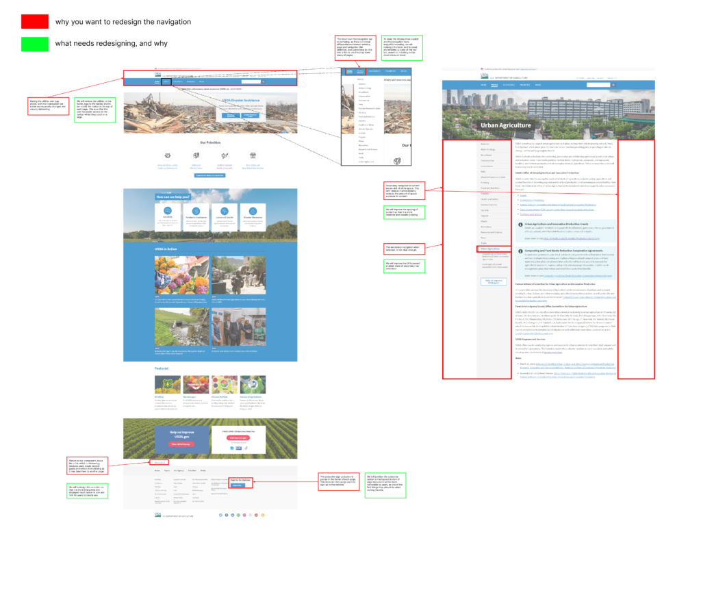
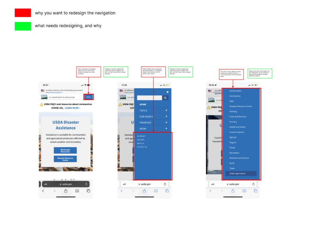
I conducted a Heuristic Evaluation of the current website via desktop and mobile, to better understand and analayse the current UX layout, arrangement, UI patterns and more, to identify what can be improved upon or removed. The client had requested a detailed breakdown for the intended UI modifications for the home page and antoher further additonal pages I would like to redesign. For this reason, I created an annotated visual evaluation, to clearly show what page elements require a redesign and why.
Why a user might visit the site:
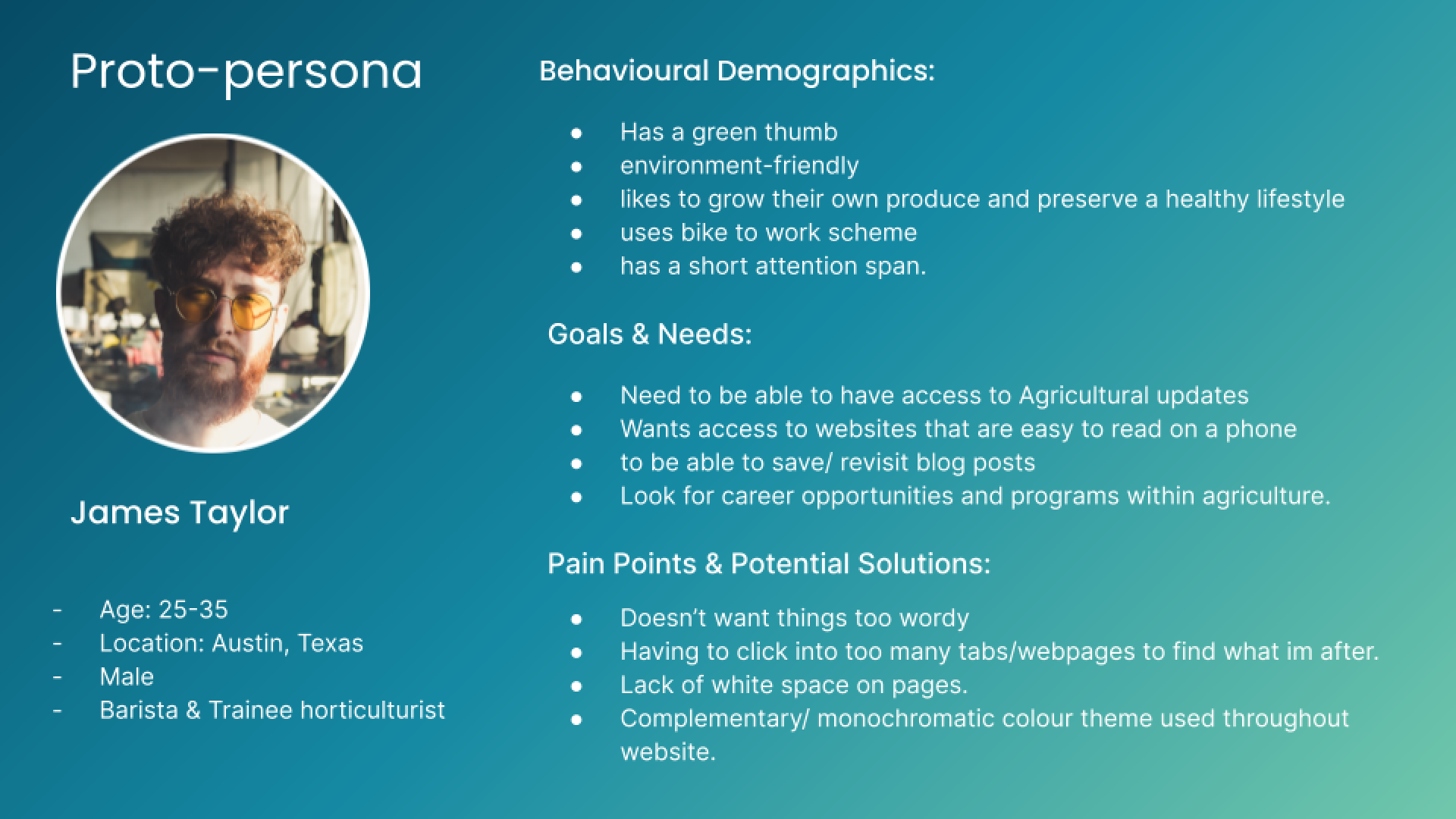
A user may visit the website because they have interest or passion for growing their own crops and want to live or preserve a healthy lifestyle doing so. Users may also want to read up on the latest news/blogs regarding recent natural disasters and climate change announcements, as well as master the best agricultural practices. For hte purpose of this redesign, I proposed to the cleint that I would like to explore the user journey from the perepective of a horticulturist wanting to read upon or access horticultrure programs via the website.
User Path:
Home Page → Navigation bar → Topics → ‘Urban Agriculture’ → Programs & Services (external link)
IA Navigation & Branding
Site Map
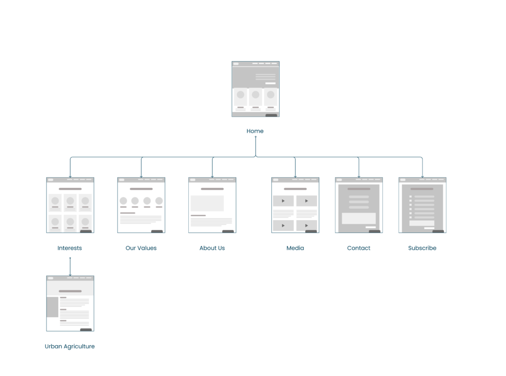
Shown is the new sitemap for the UI redesign of the government website. It displays the main/key pages of the site that exist on the main navigation. The reason I did this was because I wanted to highlight the main navigation for this particular user journey, and make it clear the client about the new information architecture of this site redesign. So, I synthesized a card sorting and grouping process to achieve this outcome.

Brand voice & Statement
I defined 5 adjectives that would strategically influence the style, perspective, and personality of the new brand identity through structure, syntax, and UI elements. Shifting the brand identity to become more welcoming, engaging, and visually stimulating.
IA Interaction Design
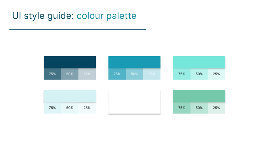
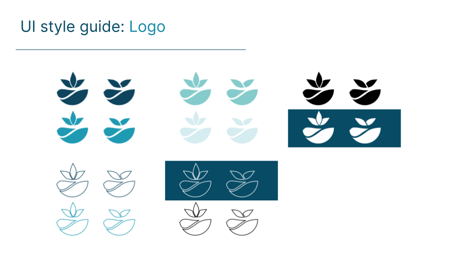
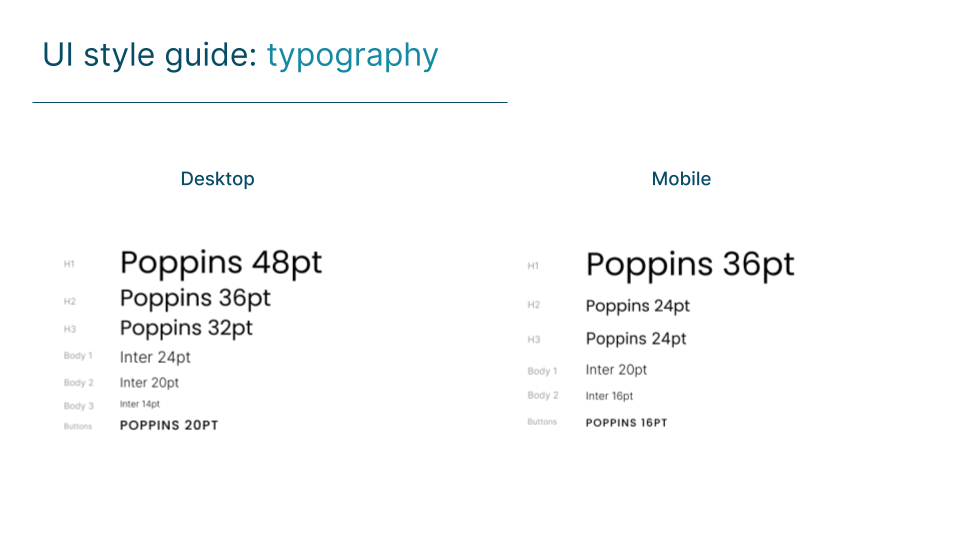
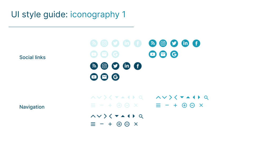
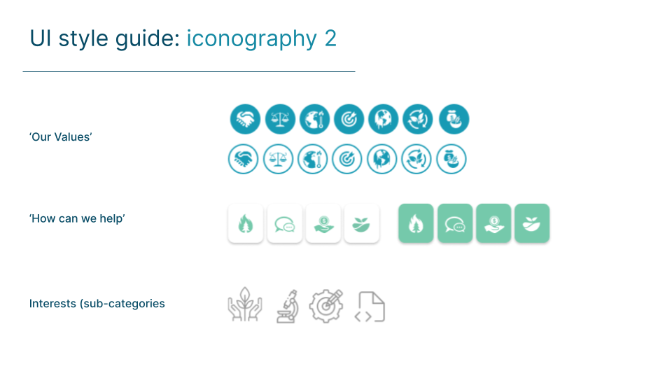
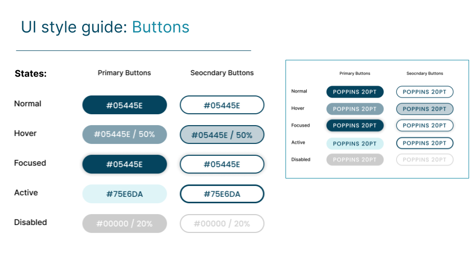
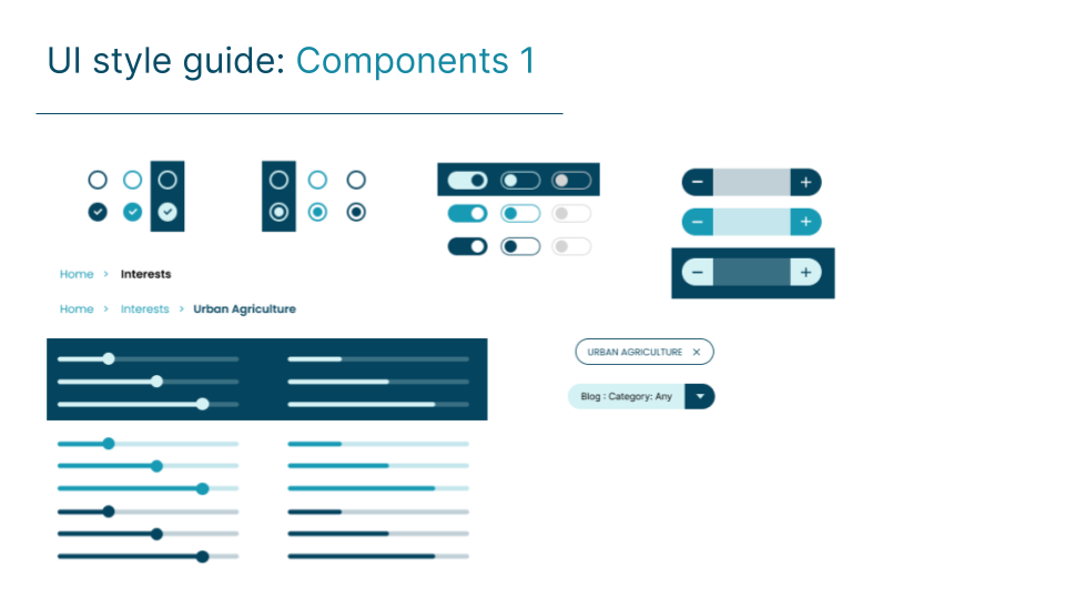
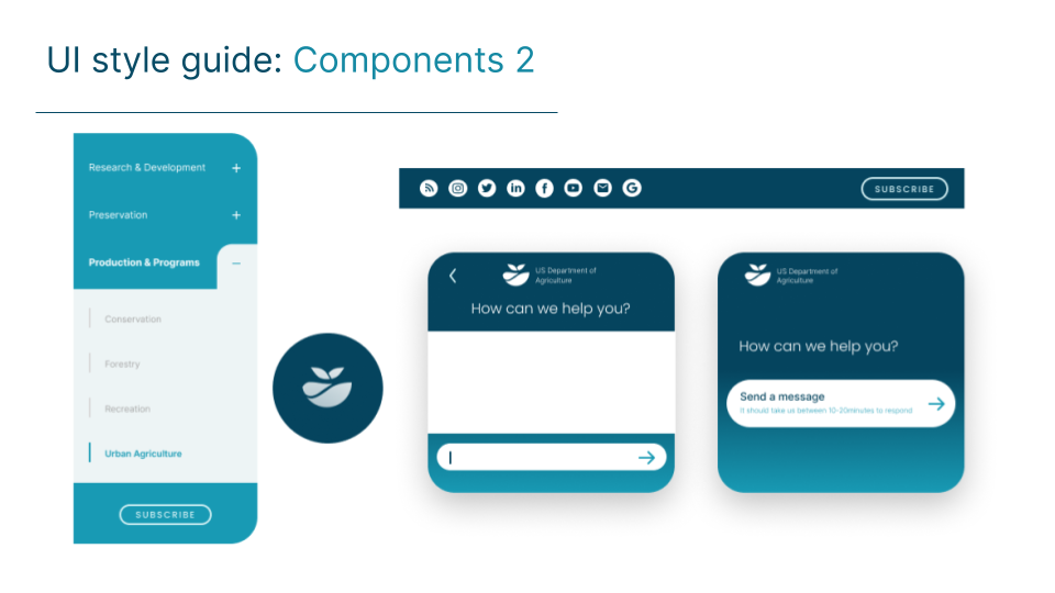
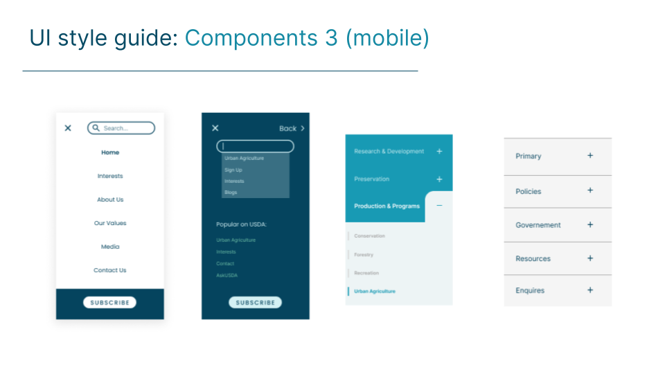
Style Guide
UI Testing & Prototype
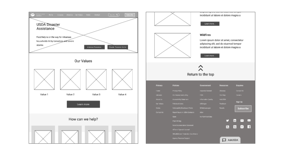
Usability Test
A 5 second usability test was conducted to see whether users know what the website was about and has to offer, from first glance.
‘Alot quicker to navigate for the Urban Agriculture page, as it only requires 2 steps’.
‘Breadcrumb should be positioned further to the left.’
‘Social links and subscribe button should be positioned at the top of the footer.’
Visual Design
Homepage (After)
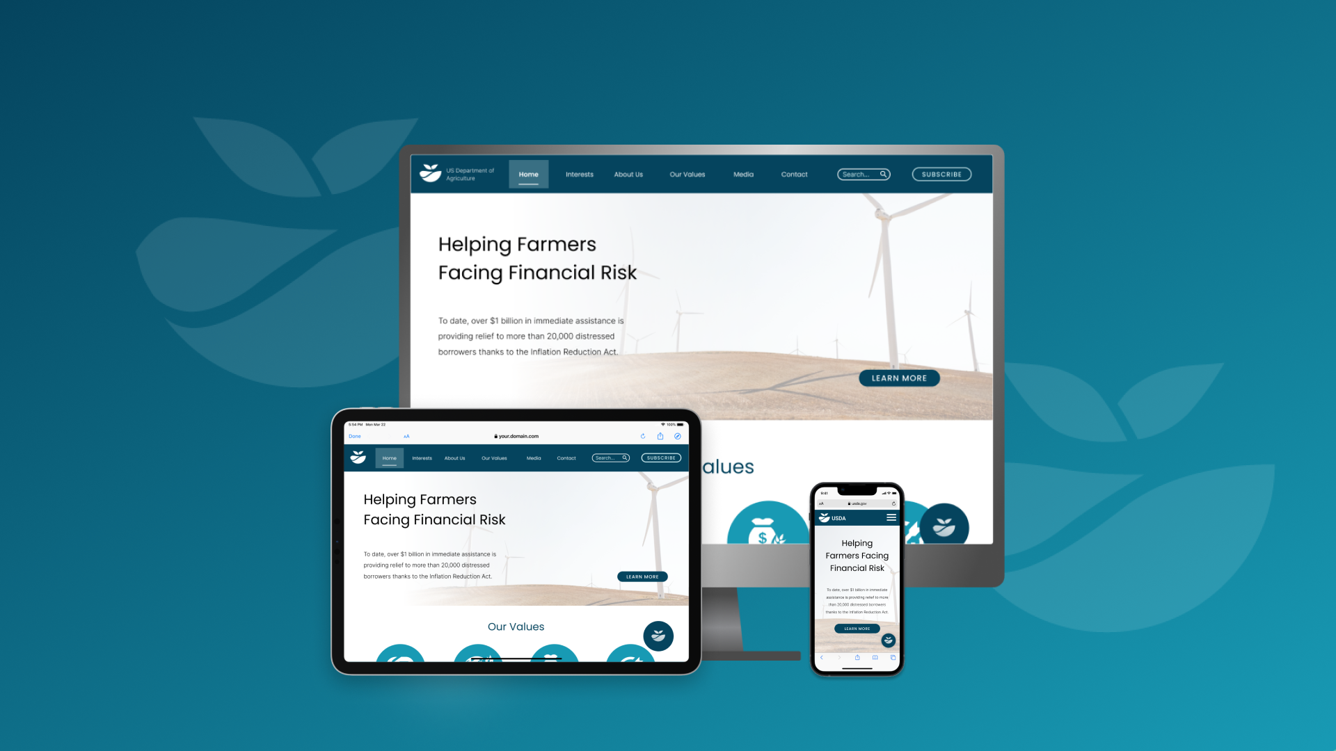
After testing, I took on the feedback given, and implemented them, alongside my own observations and modifications, to an updated visual design, in which you can see here:

‘Footer social links and subscribe button has been moved on top of footer content.’
‘Breadcrumb should be positioned further to the left.’
‘Social links and subscribe button should be positioned at the top of the footer.’
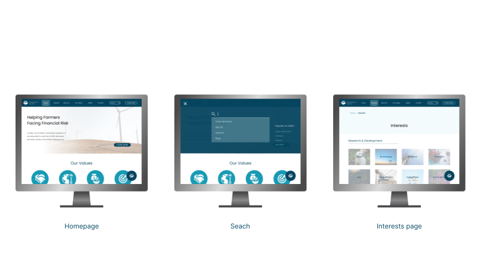
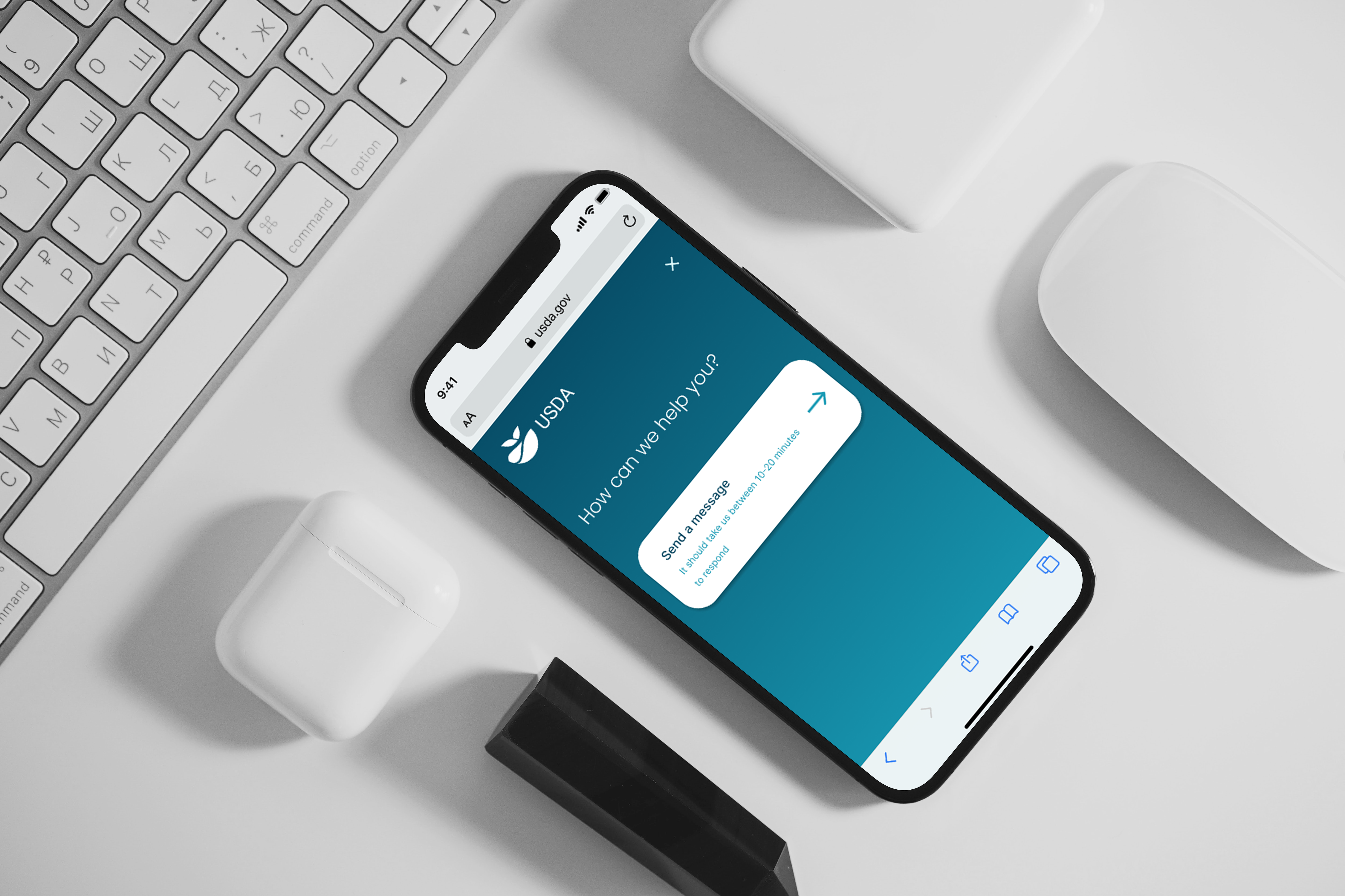
Hi Fidelity Prototypes

Conclusion
Overall I am happy with the outcome of my redesign. I achieved a modern yet simplistic display that can be used with ease by users of the site.
If there’s anything i could do better, it would be to consider contacting the stakeholder of the website to both strengthen and validify my redesign project thesis.


